Grouped bars
Cloudera Data Visualization enables you to create Grouped Bar visuals, which show clustered groups of related measurements as bars, enhancing comparisons among categories. While bar charts show comparisons among categories, grouped bar charts show clustered groups of related measurements as bars.
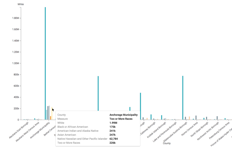
The following steps demonstrate how to create a Grouped Bars visual representation of ethnic distribution of population in some US counties. The example is based on the US Counties dataset. For more information, see Adding data and Creating a dataset.
For an overview of shelves that specify this visual, see Shelves for grouped bars.
-
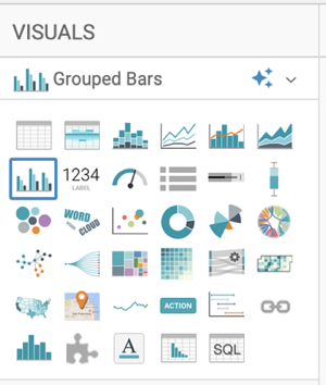
In the VISUALS menu, find and click Grouped
Bars.
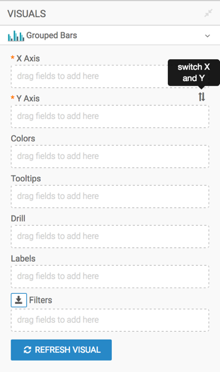
You can see that the shelves of the visual changed.
The mandatory shelves are X Axis and Y Axis. Fields placed on these shelves can be swapped to produce a horizontal chart.
-
Populate the shelves from the available fields (Dimensions,
Measures) in the DATA menu.
-
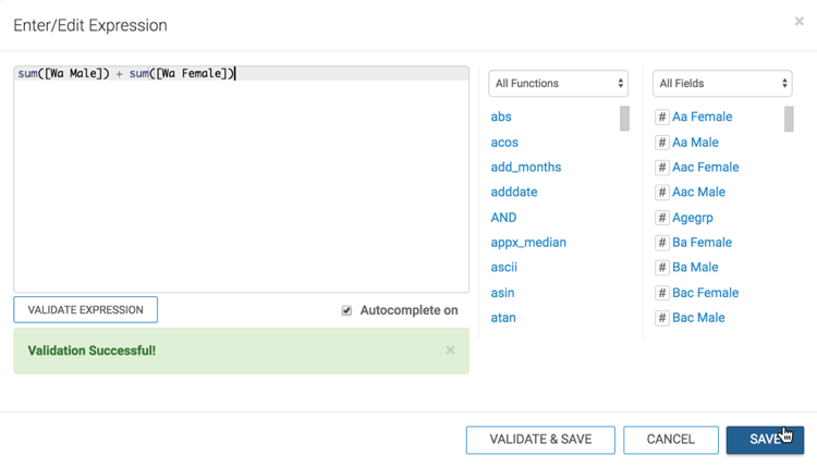
In the Enter/Edit Expression modal window, edit the
expression to the following:
sum([Wa Male]) + sum([Wa Female])
Click VALIDATE EXPRESSION, and then click SAVE.
-
Add the field
Stnameto the Filters shelf and select the value 'Alaska'.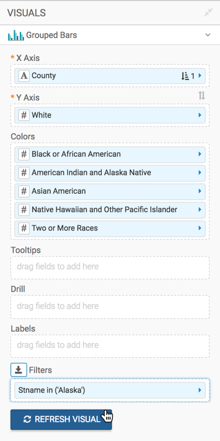
-
In the Enter/Edit Expression modal window, edit the
expression to the following:
-
Click REFRESH VISUAL to generate the Grouped Bars visual.