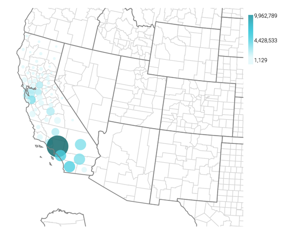
Cloudera Data Visualization Map visuals can use bubbles to show relative
measurement values for countries. You can display two measurements at the same time: the first
measurement as the color of the bubble, and the second one as the relative size of the
bubble.
The following steps demonstrate how to create a new map visual on the dataset World Life
Expectancy [data source samples.world_life_expectancy]. It produces
bubbles with area that corresponds to the relative population in each country.
Start a new visual based on the World Life Expectancy dataset.
For instructions, see Creating a visual.
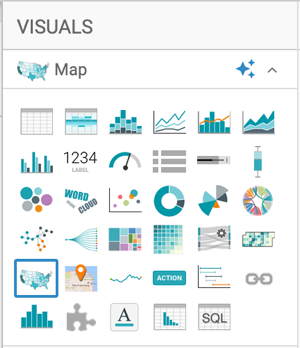
In the VISUALS menu, find and click
Map.
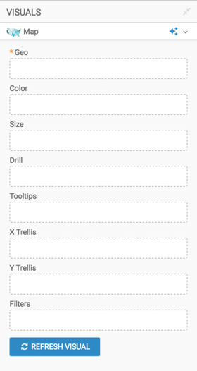
The shelves of the visual changed. They are now Geo,
Color, Size, Drill,
Tooltips, X Trellis, Y
Trellis, and Filters. The only mandatory shelf for
map visuals is Geo.
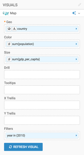
Populate the shelves from the available fields (Dimensions and
Measures) in the DATA menu.
Under Dimensions, select country and add it
to the Geo shelf.
Under Measures, select population and add
it to the Color shelf.
Under Measures, select gdp_per_capita and
add it to the Size shelf.
Under Measures, select year and add it to
the Filters shelf. When the Filter for
year window modal appears, select 2010 in the
Values tab, and click APPLY.
Change the map from choropleth to bubble marks, as described in Displaying bubbles on
maps.
Adjust the size range of the marks to 1-10, as described in Changing the mark size
range.
Click REFRESH VISUAL.
The map visual graph appears.
Optional: On the Tooltips shelf, add several fields from
Dimensions and Measures.
This enables you to see specific descriptive information in your visuals, such as
input values, segment affiliation, and calculations.
For example, from
Dimensions, drag un_subregion,
un_region, and year to the
Tooltips shelf.
Optional: Alias the fields on the shelves to improve the readability of the visual and its
tooltip.
population as Population
un_subregion as UN Subregion
un_region as UN Region
year as Year
For instructions, see Alias.
Optional: Format the number reported by the GDP per Capita field to include a thousands
separator, and format Year not to use the thousands separator.
For more information, see Real number display format and Integer
display format.
Optional: [Recommended] Enable panning and zooming option, as described in Customizing
zoom.
Optional: Change the color palette to blue, as described in Change color palette
visuals.
Click REFRESH VISUAL.
You can move the visual (pan), zoom in and out, and see the details in the Tooltips
text.
Click the pencil/edit icon next to the title of the
visualization to enter a name for the visual.
In this example, the title is changed to 'World Population - Map with Bubbles'. You can
also add a brief description of the visual as a subtitle below the title of the
visualization.
At the top left corner of the Dashboard Designer, click
SAVE.
This site uses cookies and related technologies, as described in our privacy policy, for purposes that may include site operation, analytics, enhanced user experience, or advertising. You may choose to consent to our use of these technologies, or