Cloudera Data Visualization Map visuals let you plot measurements, as areas,
over US State regions.
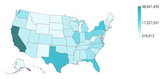
A map of the United States shows a comparison of measurement values among US States. The
following steps demonstrate how to create a new map visual on the dataset US County
Population [data source samples.us_counties]. It produces colored
regions for the measurements that correspond to the state field.
Start a new visual based on the US County Population dataset.
For instructions, see Creating a visual.
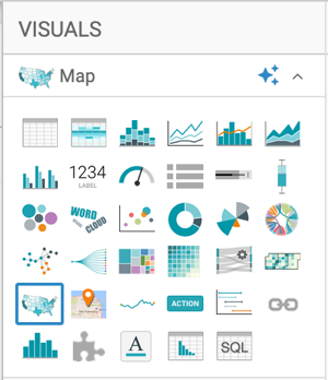
In the VISUALS menu, find and click
Map.
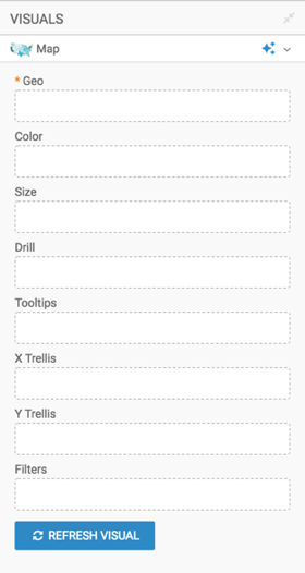
The shelves of the visual changed. They are now Geo,
Color, Size, Drill,
Tooltips, X Trellis, Y
Trellis, and Filters. The only mandatory shelf for
map visuals is Geo.
Populate the shelves from the available fields (Dimensions,
Measures) in the DATA menu.
Under Dimensions, select stname and add it
to the Geo shelf.
Click the field to open the FIELD PROPERTIES menu, expand
the Change Type option, and select the Geo
TypeState.
Under Measures, select tot_pop and add it
to the Colors shelf.
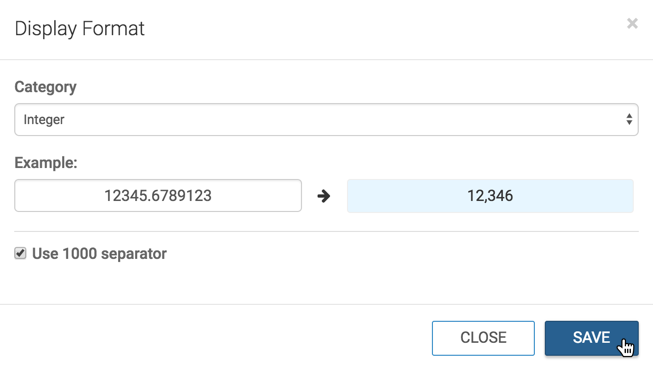
Click the field to open the Field Properties menu, select
Display Format,CategoryInteger, and select the thousands separator option. Click
Save.
Optional: Alias the field stname as State, and
sum(tot_pop) as Population; see Alias.
Optional: Enable panning and zooming option, as described in Customizing zoom.
Optional: Change the color palette, as described in Change color palette of
visuals.
Click REFRESH VISUAL.
The map visual appears.
Click the pencil/edit icon next to the title of the
visualization to enter a name for the visual.
In this example, the title is changed to 'US State Population - Choropleth Map'. You
can also add a brief description of the visual as a subtitle below the title of the
visualization.
At the top left corner of the Dashboard Designer, click
SAVE.
We want your opinion
How can we improve this page?
What kind of feedback do you have?
This site uses cookies and related technologies, as described in our privacy policy, for purposes that may include site operation, analytics, enhanced user experience, or advertising. You may choose to consent to our use of these technologies, or