You can create Histogram visuals in Cloudera Data Visualization. Histograms
enable the quick visual analysis of numerical data distribution. They provide an estimate of
the frequency distribution of a continuous quantitative variable, accomplished by splitting
it into consecutive, non-overlapping intervals, referred to as "buckets".
To work around this limitation, first save the calculated metric as derived data, and
then use this field as a measure in a histogram. See Derived data.
When you change the number of buckets (the default is 10), Cloudera Data Visualizationn determines the data range and splits it equally
among the buckets, groups the metric into these buckets, and plots vertical bars to
represent it.
Histograms support both normalized and cumulative forms, and may be
used in a trellis formation.
The following steps demonstrate how to create a new histogram visual on the World
Life Expectancy dataset.
For an overview of shelves that specify this visual, see Shelves for
histograms.
Start a new visual based on the World Life Expectancy dataset.
For instructions, see Creating a visual.
In the VISUALS menu, select
Histogram.
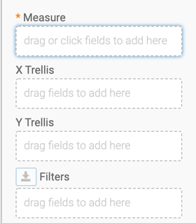
The shelves of the visual changed. You can see:
Measure (mandatory), X
Trellis, Y Trellis, and
Filters.
To show specific items, populate the shelves from the available fields
(X Trellis, Y Trellis) in the
DATA menu.
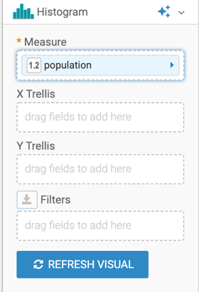
Under Measures, select population and
drag it to the Measures shelf.
Click REFRESH VISUAL.
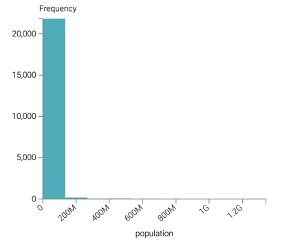
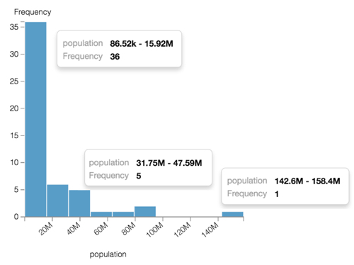
The default histogram visual appears, dividing the data into 10 buckets. As
you can see, most the data is in the first bucket, and this visual is not
very enlightening.
On the Filters shelf, add several
Dimensions and Measures from
the DATA menu.
This enables you to dynamically control the data input and discover the data
at a more granular level.
For example, from Dimensions,
drag year to the Filters shelf and
select the year 2010.
You can also add
un_region to the Filters shelf
and select Africa.
Click REFRESH VISUAL.
The shape of the diagram has changed. Hovering the mouse over the histogram
shows the data ranges and frequency for each bucket of the histogram.
You can see that the filtering options significantly reduced result set.
Change the title to World Population - Histogram.
[Optional] You can also add a brief description of the visual as a subtitle
below the title of the visualization.
Click SAVE at the top left corner of the
Dashboard Designer.
We want your opinion
How can we improve this page?
What kind of feedback do you have?
This site uses cookies and related technologies, as described in our privacy policy, for purposes that may include site operation, analytics, enhanced user experience, or advertising. You may choose to consent to our use of these technologies, or