Trellis on dimensions
Trellising charts on dimensions produces multiple charts that focus on a distinct section of data.
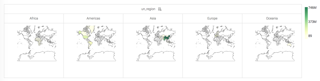
Trellising on one dimension
In this example, the field un_region becomes a trellising dimension when it
is placed on the X shelf of a map visual.
This setup produces a trellised version of a map visual, on one dimension.
You can trellis many of the charts where the X and Y shelves are optional, by placing the field that represents the partition there.
When using mandatory shelves, such a X Axis and Y Axis on bar visuals, place two dimensions on the shelf. Cloudera Data Visualization uses the first field to trellis the visual, and the second field in the visual itself.
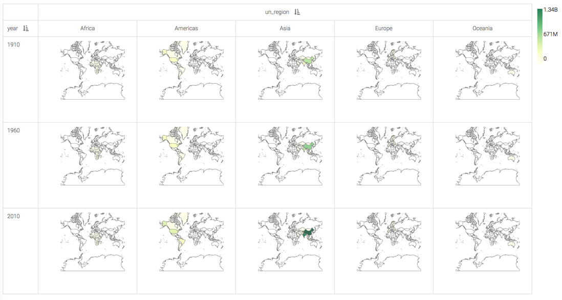
Trellising on two dimensions
You can take it one step further, and define a secondary trellis for your visuals by placing yet another dimension on the Y shelf.
Here, the year field is used both on the Y shelf and
on the Filters shelf, selecting years 1910,
1960, and 2010 to demonstrate the comparable populations
across continents, and in 50-year increments.
This setup produces a map visual that is trellised on two dimensions, UN Region and Year.