You can easily create new visual representations for your data in Cloudera Data Visualization.
The following steps demonstrate how to create a new
visual.-
On the main navigation bar, click VISUALS.
-
Click to open a new, blank dashboard.
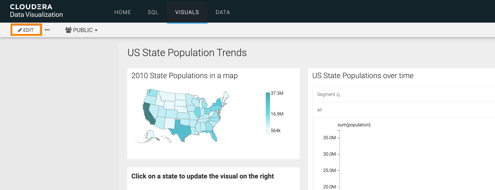
If you already have an existing dashboard and you just want to add a new visual, open
the dashboard and click EDIT to make changes to it.
-
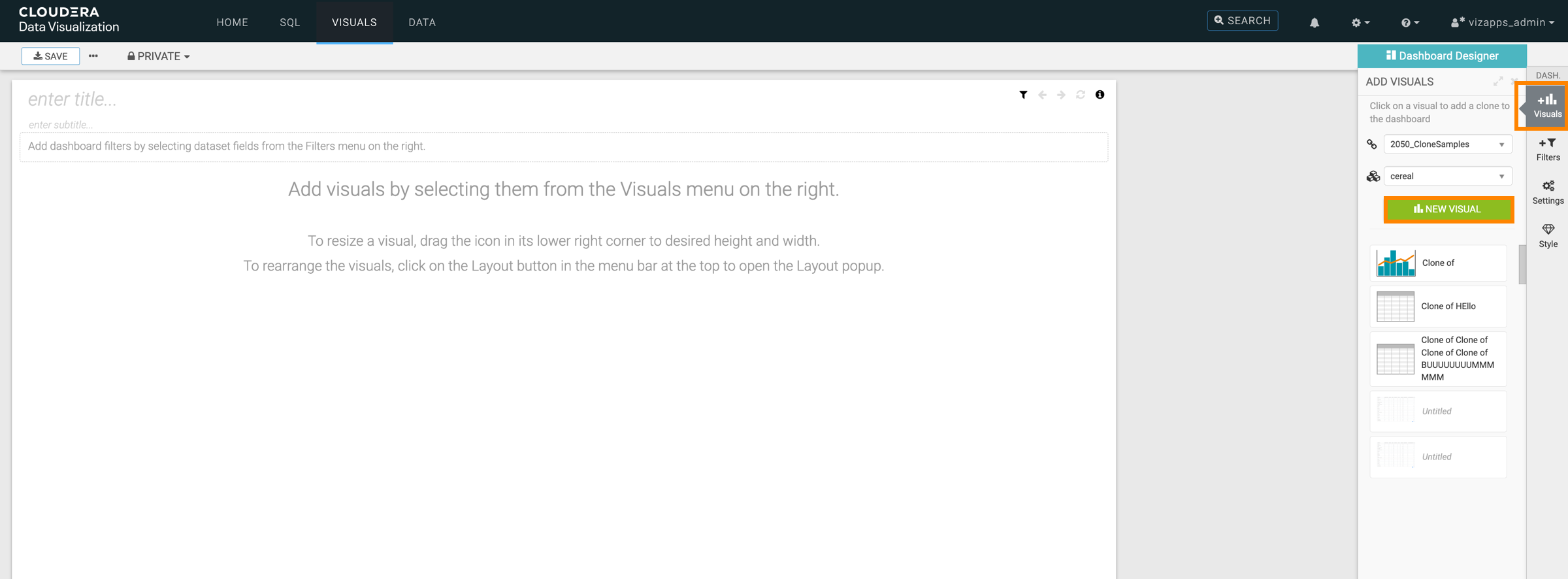
In the Dashboard Designer interface, open the
Visuals menu from the side menu bar and click NEW
VISUAL.
-
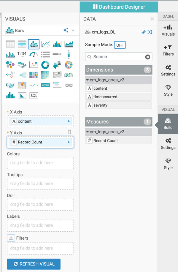
The Visual Builder appears.
By default, a table visual is selected. For more information, see the Visual
Builder overview.
-
Choose the visual type you want to build.
In this example, the Bars visual has been selected.
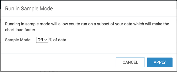
- Optional:
You can switch on Sample Mode for the visual you are
building.
With sample mode, you create the visual on a subset of your data to test it. You can
define this subset as a percentage of the original data.
-
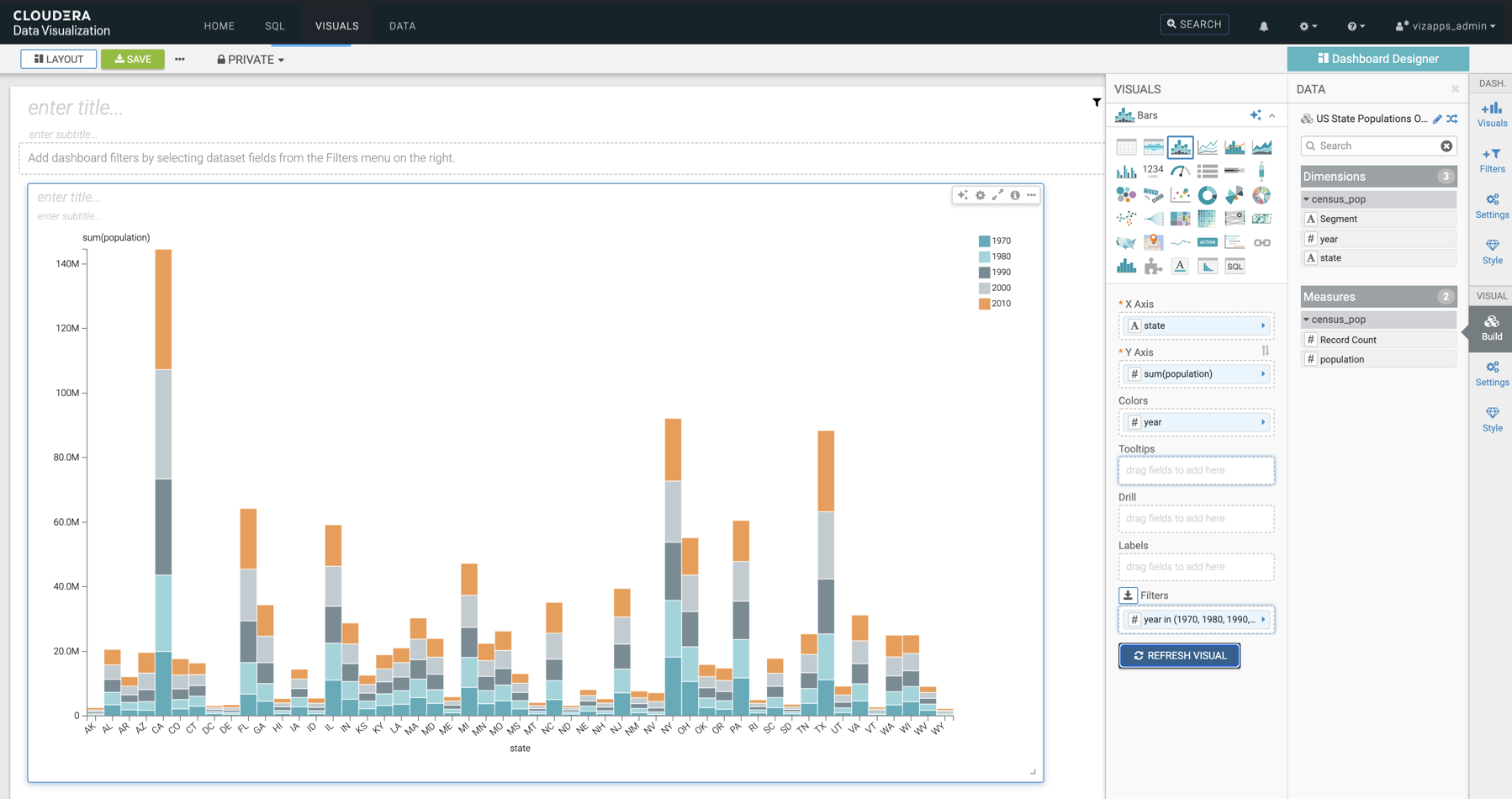
Populate the shelves of the visual from the Dimensions and
Measures fields:
In this example, the following fields have been added:
- state dimension on the X Axis
shelf
- population measure on the Y Axis
shelf
- year measure on the Colors shelf
- year measure on the Filters shelf
-
Click REFRESH VISUAL.
-
Click the enter title... field and enter a name for the
visual.
-
In this example the title 'Recent US Census Results by State' has been added.
-
You can also click the enter subtitle... field below the
title of the visualization to add a brief description of the visual.
-
Click SAVE at the top left corner of the Dashboard
Designer.