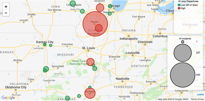
Cloudera Data Visualization enables you to plot qualitative ranges of data by
specifying the data segmentation on the Color shelf of an Interactive Map visual.
The following steps demonstrate how to plot incident counts on an Interactive Map. Truck
movement data is used in the example.
Select the appropriate dataset, and create a new dashboard.
In the dashboard, open the default visual and change the visual type to
Interactive Map.
Enable Circles, as described in Displaying circles.
Click the Settings menu.
Select Circles > Enable Circles.
Enable both the area and color legends of Circles by selecting the
Add Circles Area Legend and Add Circles Color
Legend options.
Optional: Disable all the other layers: heatmap, cluster, marker, and route.
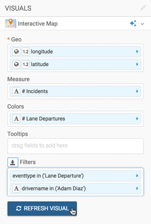
Populate the shelves from the available fields (Dimensions and
Measures) in the DATA menu.
Geo Shelf - Under Measures, select
latitude and longitude, and add them to the
Geo shelf.
If your longitude and latitude measurements are not automatically recognized
(appear with a (globe) icon on the Geo
shelf), cast them to the appropriate Geo Type.
Click the field on the shelf to open the FIELD PROPERTIES
menu.
Select Change Type and choose
Latitude or Longitude as
appropriate.
For more information, see Change type and Geo data
type.
Measures Shelf - Under Measures,
select eventtype and place it on the measures shelf.
Change the aggregation function to count().
Alias the field as # Incidents.
Colors Shelf - Under Measures, select
eventtype and place it on the Colors
shelf.
Click the field on the shelf, to open the FIELD
PROPERTIES menu.
Select the [] Enter/Edit Expression option.
Change the field expression to split the data into two qualitative ranges,
High and
Low:
case when count([eventtype]) > 20 then 'High' else 'Low (20 or less)' end
Change the field Alias to # Lane Departures.
Filters Shelf - Add the field eventtype to
this shelf, and select the single value 'Lane Departures'.
[Optional] Add the field drivername to the filters shelf, and
select a small number of drivers to see details.
Optional: Change the color palette to ensure that the colors are distinct: Click
Colors, and select an appropriate palette.
In this example, because the data is divided into two distinct groups, a two-color
palette is chosen.