
When you open Ambari Web, you are placed in the Dashboard view. This view gives you an overview of the state of your cluster as a whole.
The Dashboard View is divided into two main sections:
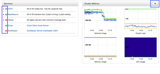
On the left side of the screen is the Services summary. You can use this section to get an overall view of the status of your services. In the image above, notice that HDFS, MapReduce, and Oozie have green dots next to them but that HBase and ZooKeeper have red dots. The dot colors give you a quick overview of the service's status.
Solid Green - All masters are running
Blinking Green - Starting up
Solid Red - At least one master is down
Blinking Red - Stopping
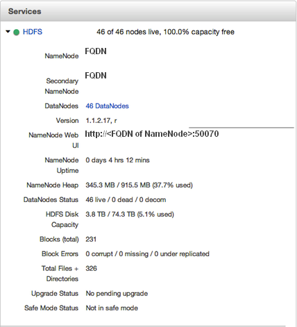
Notice also that HDFS, MapReduce, and HBase all have small triangles next to them. These are the services that are deployed in master/slave sets. Click the triangle to open a more detailed picture of the service.
If an alert is raised against the service, a small rectangle showing the number of alerts raised, marked in blue below, appears next to the service name.
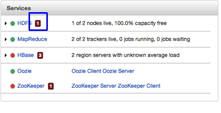
Click the service name to open the Services screen, where you can see more detailed information on the alert.
On the right side of the screen is the Cluster Metrics section. This section gives you charts for a snapshot of four important clusterwide metrics: Network Usage, Cluster Load, Memory Usage, and CPU Usage. To see a legend for the chart, hover your mouse over it. To remove a metric from the chart, click on the legend in the metric to remove the checkmark and deselect it.
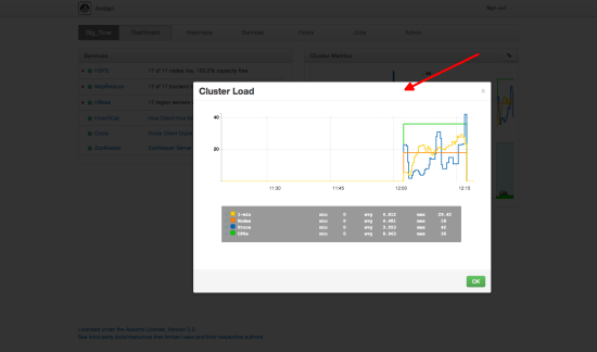
To see a larger view of the chart, click on it. The larger chart pops out.
Notice the link symbol on the upper right side of the Cluster Metric section, outlined in blue in the overview screenshot above. This is a link to the GUI for the Ganglia Server itself, where you can find much more detailed information on your cluster.
