
If you are tracking a Hive or Pig query that has been broken down into multiple interdependent jobs, you can use the Job Charts screen to see a more complete picture. The DAG tab displays a Directed Acyclic Graph (DAG) for the set of interdependent jobs and the Timeline & Tasks tab displays Timeline and Tasks information related to maps + reduces for each job in the set.
We'll use the entry for a Pig script named “wordcount"as an example.

The job row overview description shows you that the Pig script executed in three (3) interdependent jobs and required a total execution time of 105.01 seconds. This is the execution time for each job plus time for submitting and launching each job.
Now click on the job. The DAG/Charts screen pops up.
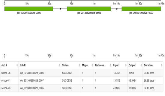
The DAG displays the execution sequence of each interdependent job as well as other information, including the duration of execution, I/O, and number of Map/Reduce tasks. The jobs are shown in a "swimlane" format, with the X-axis displaying the overall execution time, starting at 0 and increasing to 1m 45 seconds on the far right.
Click on the Timeline & Tasks tab to view the Job Timeline and Job Tasks graphs. These graphs show timing information for each task executed as part of a job. The Y-axis of the Job Timeline graph shows the number of tasks executed while the Y-axis on the Jobs Tasks graph shows the task runtime. Both graphs show the job timeline on the X-axis. Hover over the X-axis on the Job Timeline chart to see the absolute date + time in GMT.
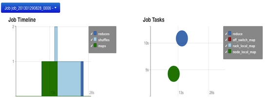
These graphs represent a job in the “wordcount” example shown above. The Job Timeline graph shows a job execution time of 29 seconds total. A single map task started around 11 seconds after launch and ran for 4 seconds. Then a shuffle task ran for about 9 seconds and finished with a reduce task for 1 second.
The Job Tasks graph also shows the job execution time on the X-axis but on the Y-axis shows run time (in seconds). When the map and reduce tasks executed and their run-time (4 seconds and 11 seconds respectively) are shown on the Y-axis. Hover on each task circle and see more details, such as Wait-time and I/O. The size of the circle shown is based on the amount of I/O for the task. For map tasks, the color of the circle indicates whether the map task ran Node Local, Rack Local or Off Switch.
