Table
A table visual displays dataset data in a tabular format, making it easy to view, compare, and analyze individual records and values. You can sort the data by any displayed measure or dimension by clicking a column header. Each click cycles through ascending, descending, and unsorted order. Table cells can also be formatted using format strings.
The following example demonstrates how to create a new tabular visual representation on the World Life Expectancy dataset. For information about the shelves available for this visual type, see Shelves for tables.
-
Create a new visual based on the
World Life Expectancydataset.For instructions, see Creating a visual. By default, the table shows all fields in the dataset. If your starting point is another visual type, select Table in the VISUALS menu.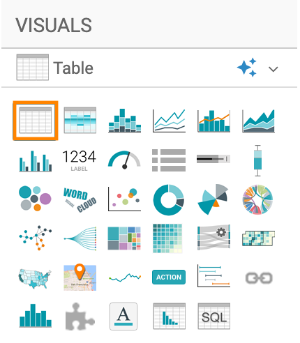
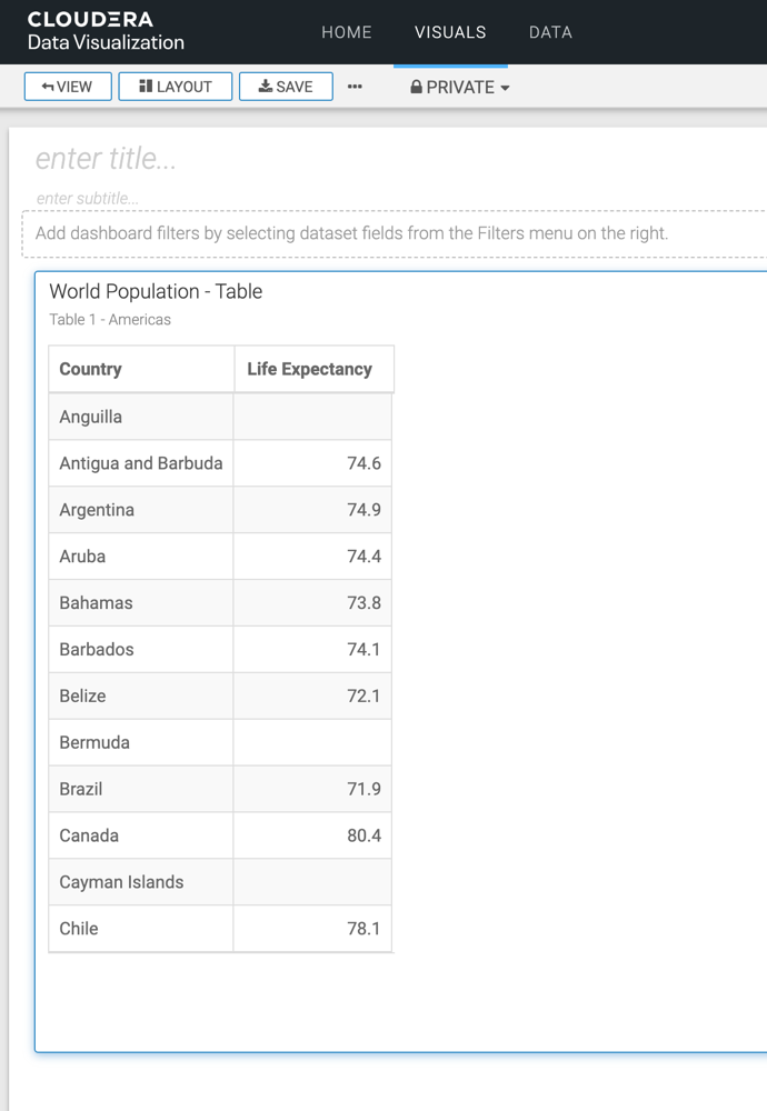
By default, the table visual displays all available dataset fields.
-
Review the available shelves.
- Dimensions
- Measures
- Tooltips
- Filters
- Limit
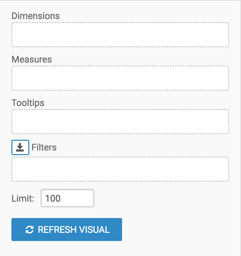
None of these shelves are required. If you do not add fields to any shelf, all available columns are displayed.
-
To show only specific items, populate the shelves from the fields available in the
DATA menu.
- Under Dimensions, select 'country' and drag it to the Dimensions shelf.
- Under Measures, select 'life_expectancy' and drag it to the Measures shelf.
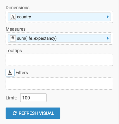
-
Change the aggregation from
'life_expectancy' field from 'sum(life_expectancy)'to'avg(life_expectancy)'.- On the Measures shelf of
the visual, click the caret-right icon to the right of the
'sum(life_expectancy)'field. - In the FIELD PROPERTIES menu, click the caret-right icon next to Aggregates to open a drop-down menu.
- From the list of aggregate functions, select Average.
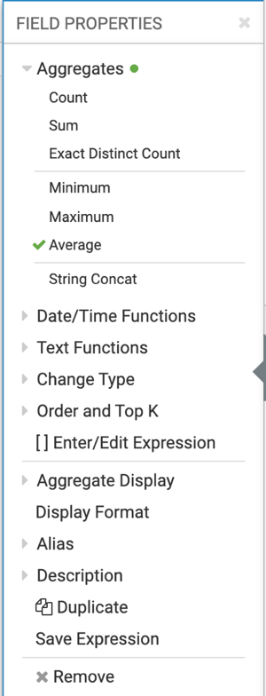
- Click the x icon at the top of the FIELD PROPERTIES menu to close it.
The shelf now contains the modified field with the
avg()aggregation function.Alternatively, you can change the aggregation at the level of the dataset, as described in Changing field aggregation.
- On the Measures shelf of
the visual, click the caret-right icon to the right of the
-
Click REFRESH VISUAL.
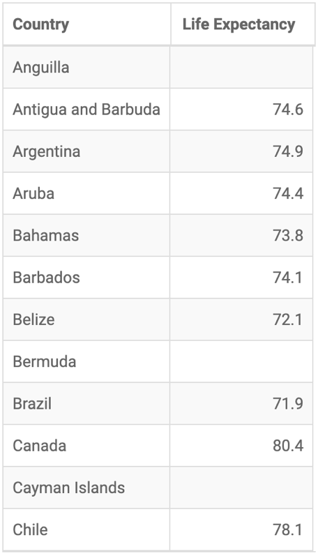
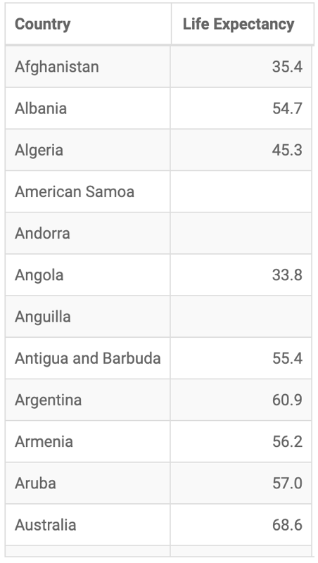
The updated table visual appears. It displays the average life expectancy by country.
-
Click REFRESH VISUAL.
The updated table visual appears.