Creating visuals with variable measures
- In the dashboard, click New Visual.
- Select the US County Population dataset in the Data menu.
- Select the Bar Chart visual type.n the Visuals menu
-
Populate the shelves of the visual:
- From Dimension, select and move
Stnamefield to the X Axis shelf. - From Measures, select and move
Tot Popfield to the Y Axis shelf. On the Y Axis shelf, change the aggregation of the Tot Pop field from
sum(Tot Pop)toavg(Tot Pop): selectTot Popfield, chose the Aggregates menu, and change the aggregate from Sum to Average.- On the Y Axis shelf, click
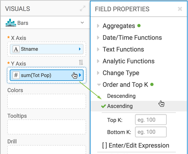
Tot Pop, and under the FIELD PROPERTIES menu select Order, and choose Ascending.

- From Dimension, select and move
-
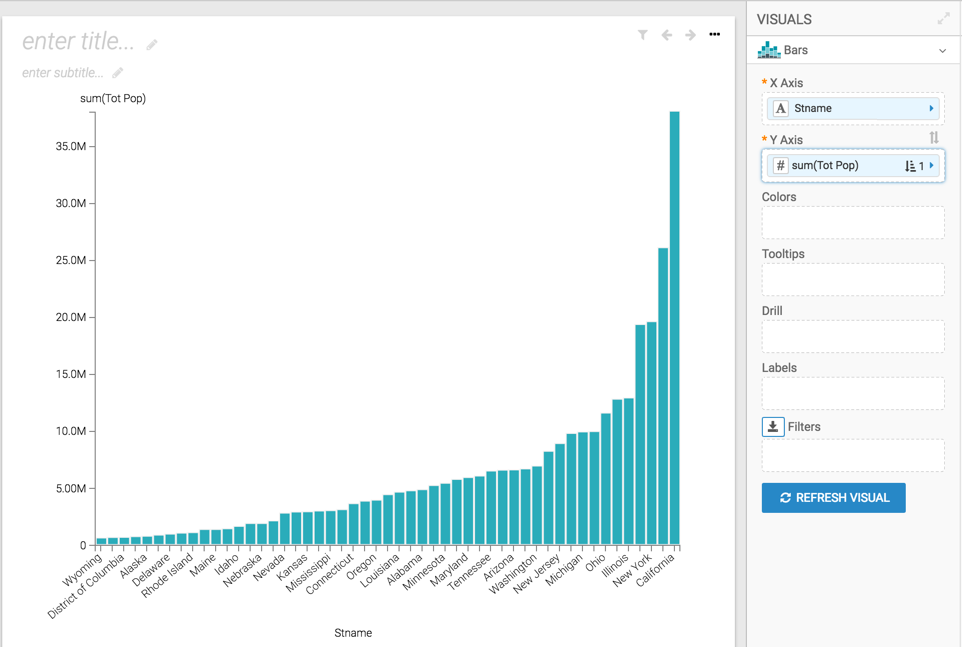
Click REFRESH VISUAL to see the basic set up of the bar
chart.

-
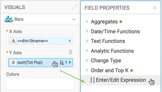
On the Y Axis shelf, click the
sum(Tot Pop)field. -
In the FIELD PROPERTIES menu, select [ ] Enter/Edit
Expression.

-
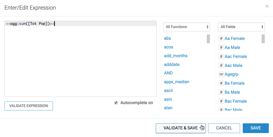
In the Enter/Edit Expression modal window, change the text to
the following expression:
<<agg:sum([Tot Pop])>>.
- Click VALIDATE & SAVE.
-
Change the name of the visual to Population by <<dim>> and
<<agg>>.
To have an informative title for the visual, you may add the parameter placeholders to it. The filters configured in Creating filters to control variable dimensions and Creating filters to control variable measures supply the required values for
<<dim>>and<<agg>>. - Click SAVE.
