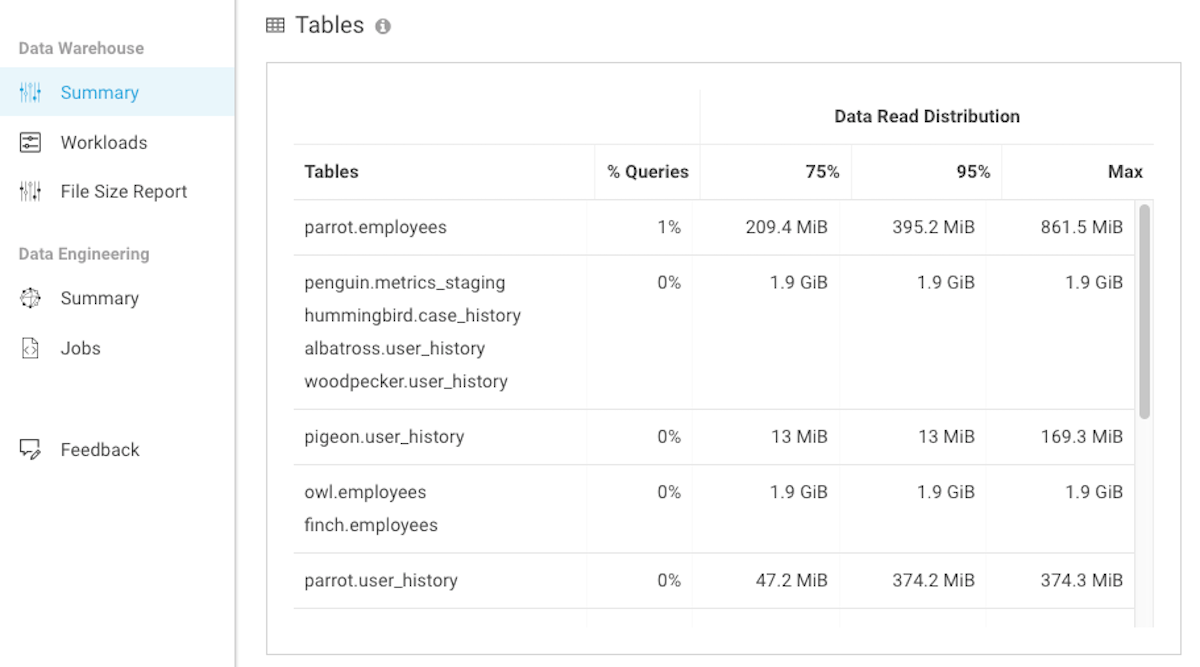
Describes the Tables chart, which lists the data table names in
your data warehouse and how often they are queried.
The Tables widget chart in the Data
Warehouse Summary page provides a quick overview of the tables that are predominantly queried in
your SQL statements.
The Data Read Distribution column, displays the distribution of data, as
a percentage, that was read by the queries. When two or more tables are displayed in a single
row, it denotes a join.
In the following example, the Data Read Distribution statistic
represents the total amount of data that was read across all the tables in a join clause. Where,
the parrot.employees table was queried in 1% of the total statements, 75%
of the query statements read 209.4 MiB or less data, 95% of the query statements read 395.2 MiB
or less data, and the query statement that read the most data accessed 861.5 MiB of data.
We want your opinion
How can we improve this page?
What kind of feedback do you have?
This site uses cookies and related technologies, as described in our privacy policy, for purposes that may include site operation, analytics, enhanced user experience, or advertising. You may choose to consent to our use of these technologies, or