

Historical Statistics of a Component
While the Summary table and the canvas show numeric statistics pertaining to the performance of a component over the past five minutes, it is often useful to have a view of historical statistics as well. This information is available by right-clicking on a component and choosing the "Status History" menu option or by clicking on the Status History in the Summary page (see Summary Page for more information).
The amount of historical information that is stored is configurable in the NiFi properties but defaults to 24 hours. For specific configuration information reference the Component Status Repository of the System Administrator's Guide. When the Status History dialog is opened, it provides a graph of historical statistics:
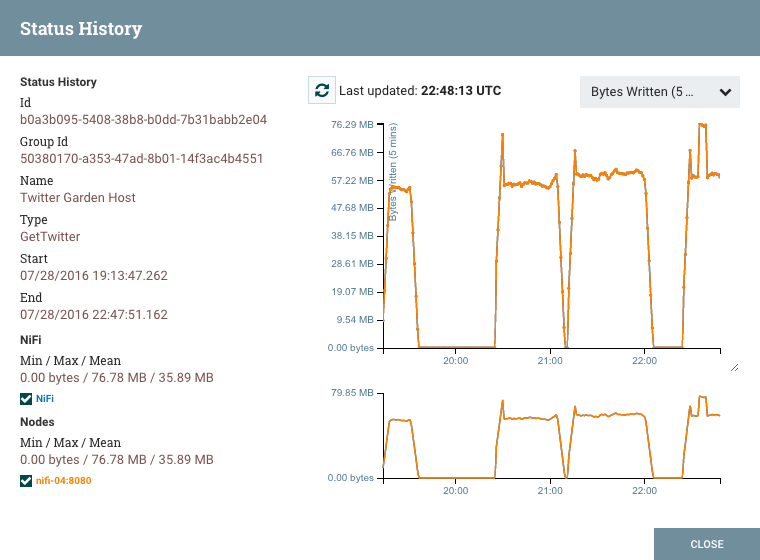
The left-hand side of the dialog provides information about the component that the stats are for, as well as a textual representation of the statistics being graphed. The following information is provided on the left-hand side:
Id: The ID of the component for which the stats are being shown.
Group Id: The ID of the Process Group in which the component resides.
Name: The Name of the Component for which the stats are being shown.
Component-Specific Entries: Information is shown for each different type of component. For example, for a Processor, the type of Processor is displayed. For a Connection, the source and destination names and IDs are shown.
Start: The earliest time shown on the graph.
End: The latest time shown on the graph.
Min/Max/Mean: The minimum, maximum, and mean (arithmetic mean, or average) values are shown. These values are based only on the range of time selected, if any time range is selected. If this instance of NiFi is clustered, these values are shown for the cluster as a whole, as well as each individual node. In a clustered environment, each node is shown in a different color. This also serves as the graph's legend, showing the color of each node that is shown in the graph. Hovering the mouse over the Cluster or one of the nodes in the legend will also make the corresponding node bold in the graph.
The right-hand side of the dialog provides a drop-down list of the different types of
metrics to render in the graphs below. The top graph is larger so as to provide an
easier-to-read rendering of the information. In the bottom-right corner of this graph is a
small handle (  ) that can be dragged to resize the graph. The blank areas of the
dialog can also be dragged around to move the entire dialog.
) that can be dragged to resize the graph. The blank areas of the
dialog can also be dragged around to move the entire dialog.
The bottom graph is much shorter and provides the ability to select a time range. Selecting a time range here will cause the top graph to show only the time range selected, but in a more detailed manner. Additionally, this will cause the Min/Max/Mean values on the left-hand side to be recalculated. Once a selection has been created by dragging a rectangle over the graph, double-clicking on the selected portion will cause the selection to fully expand in the vertical direction (i.e., it will select all values in this time range). Clicking on the bottom graph without dragging will remove the selection.