Customizing visualization types
Widgets allow you to choose from a variety of visualization types and customize them based on your requirements. Each visualization type has general configurations and its own graph style configuration that can be set when creating the widget.
Configuring widget, fields and legend
The widget, data field, label field and legend are general configurations that can be set for all of the visualization types.
Name and Description
Data fields
Label field
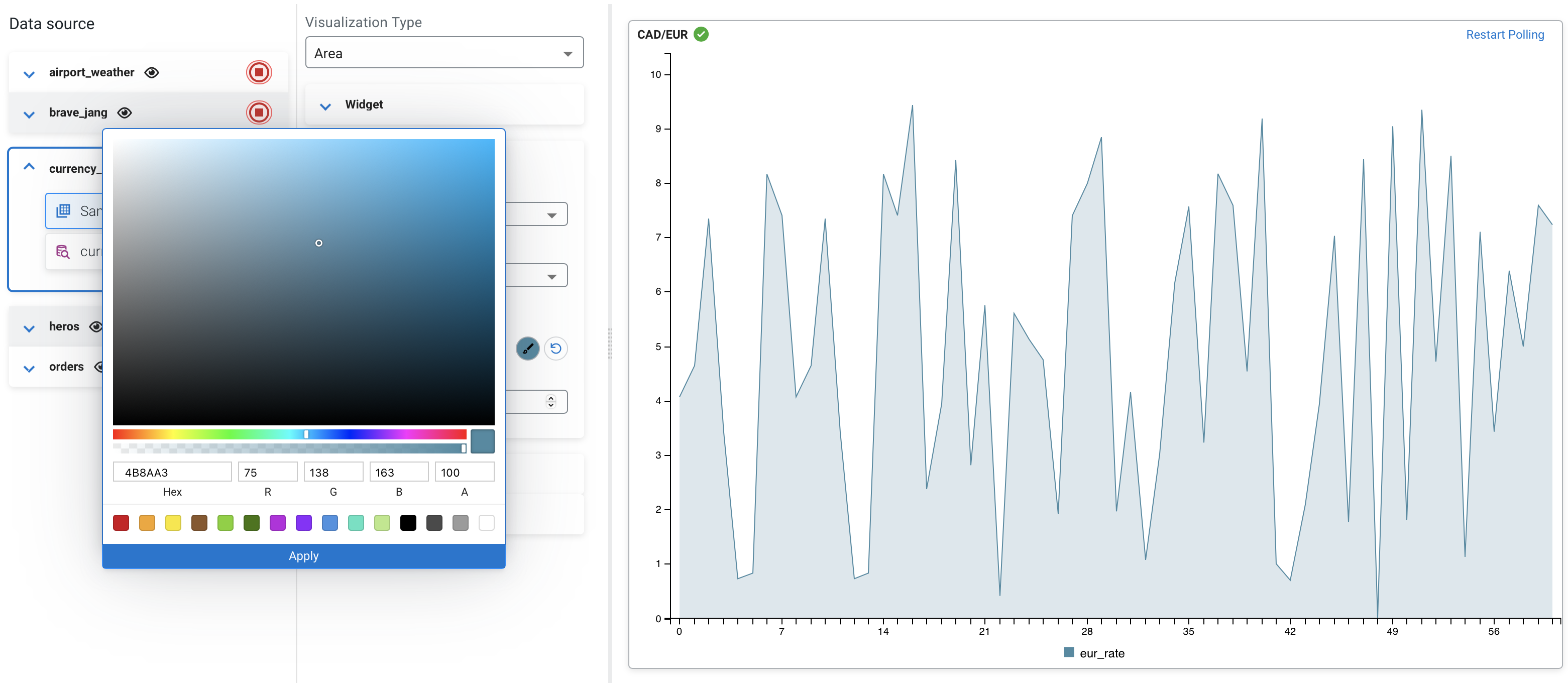
Color picker
You can change the default visualization color of the selected data fields. You can open the
color picker using ![]() button, and pick a color over the palette, or provide the Hex, RGBA
value to a specific color. You can also choose from one of the preset colors. After clicking on
Apply, the color of the selected data field is updated.
button, and pick a color over the palette, or provide the Hex, RGBA
value to a specific color. You can also choose from one of the preset colors. After clicking on
Apply, the color of the selected data field is updated.
You can reset the color of the visualization using the ![]() button.
button.
Transition duration (ms)
Visibility and position of Legend
Configuring graph style
You can customize the styles of the widgets based on how you want to visualize the data.
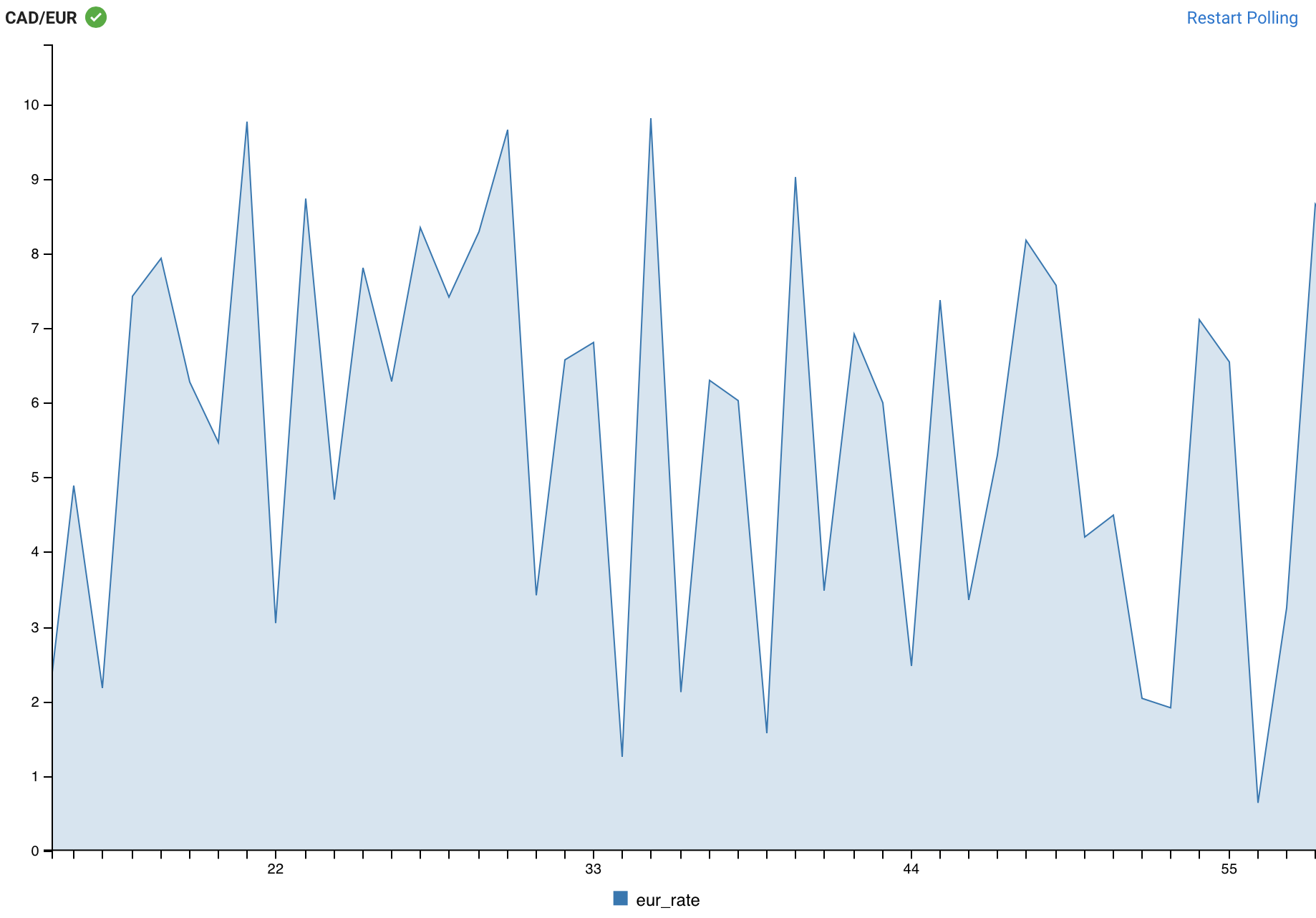
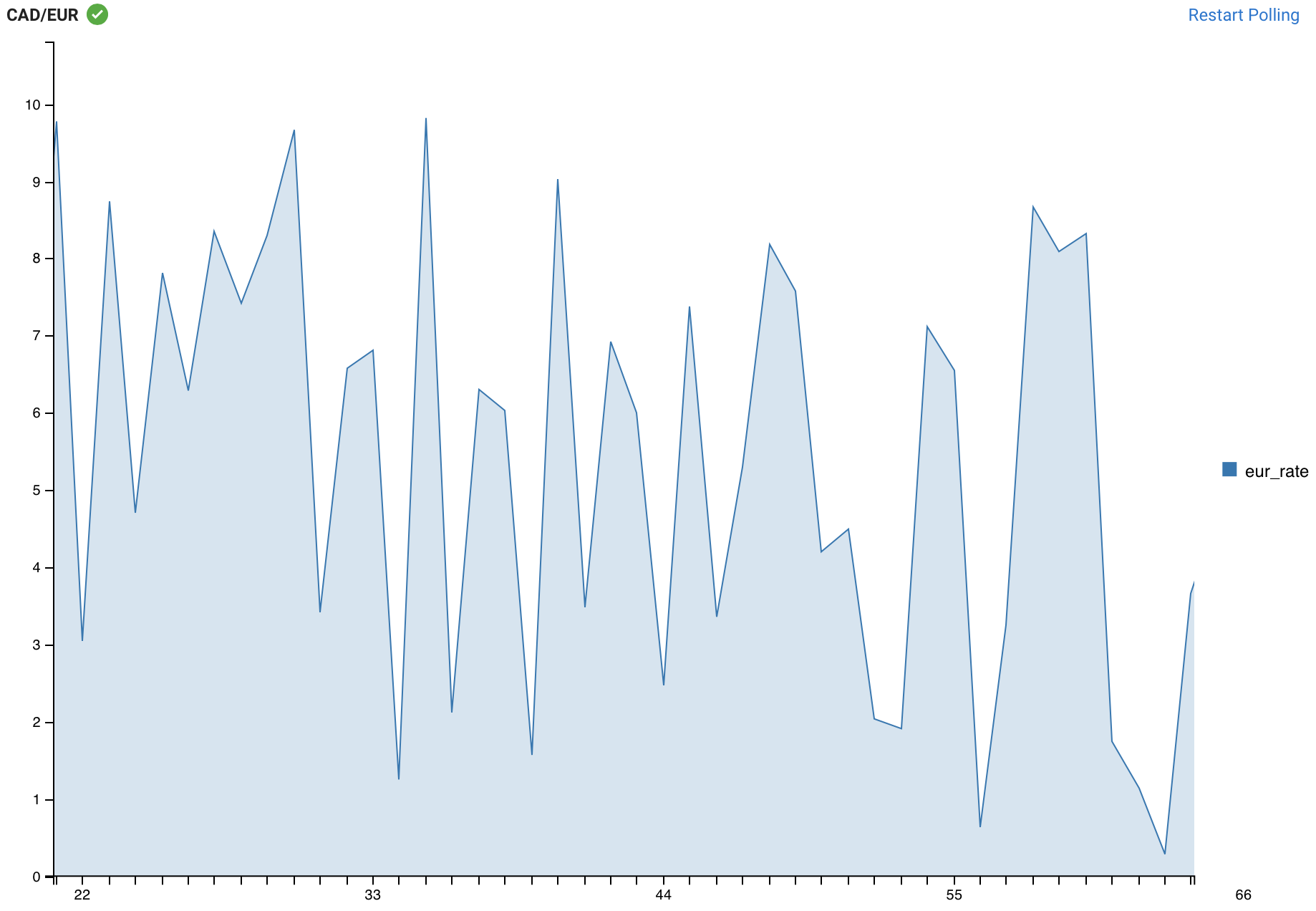
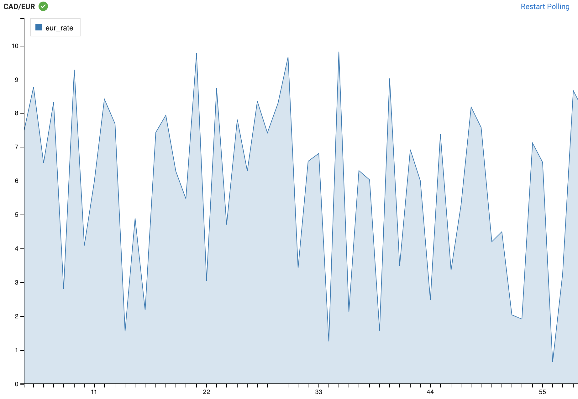
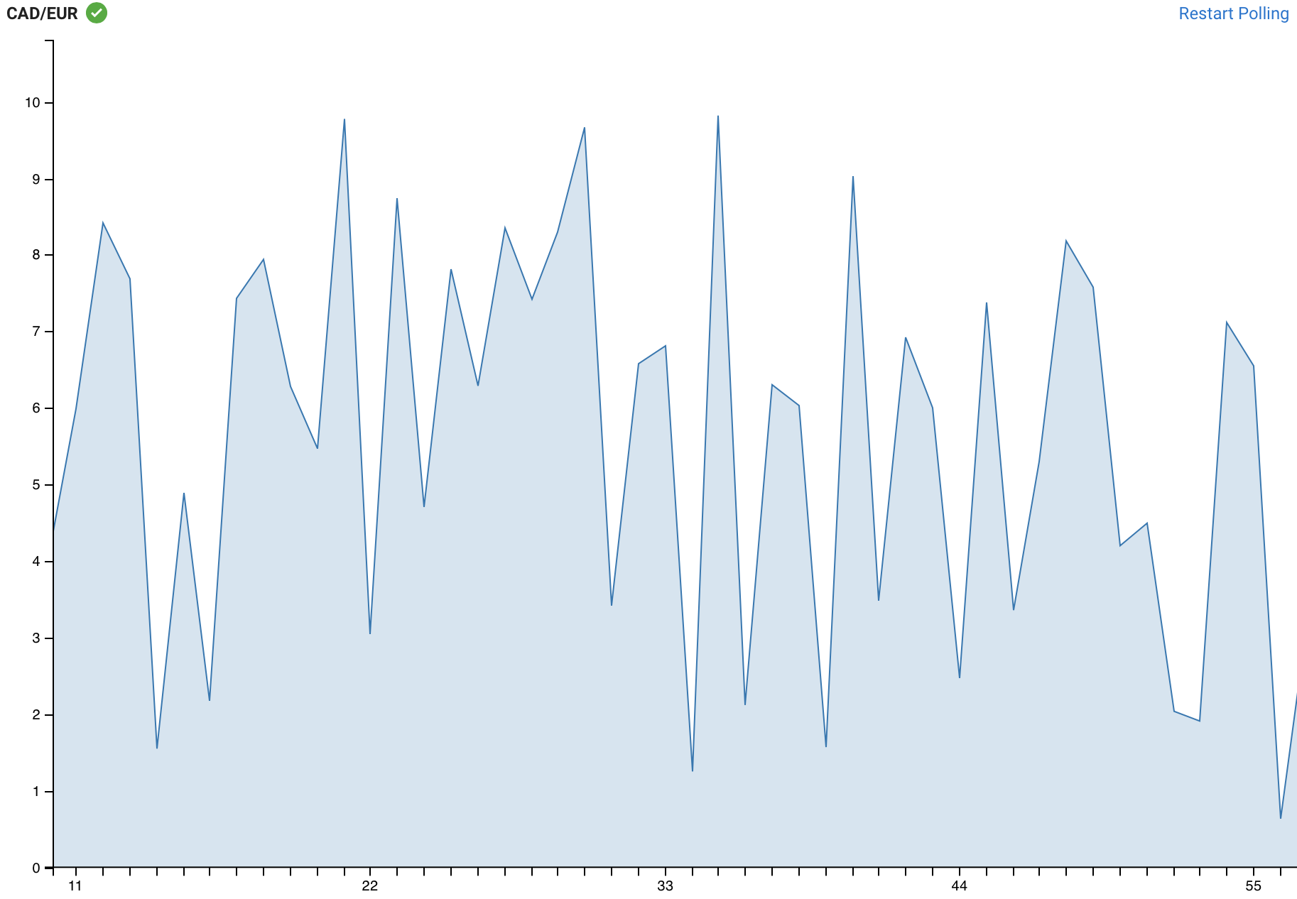
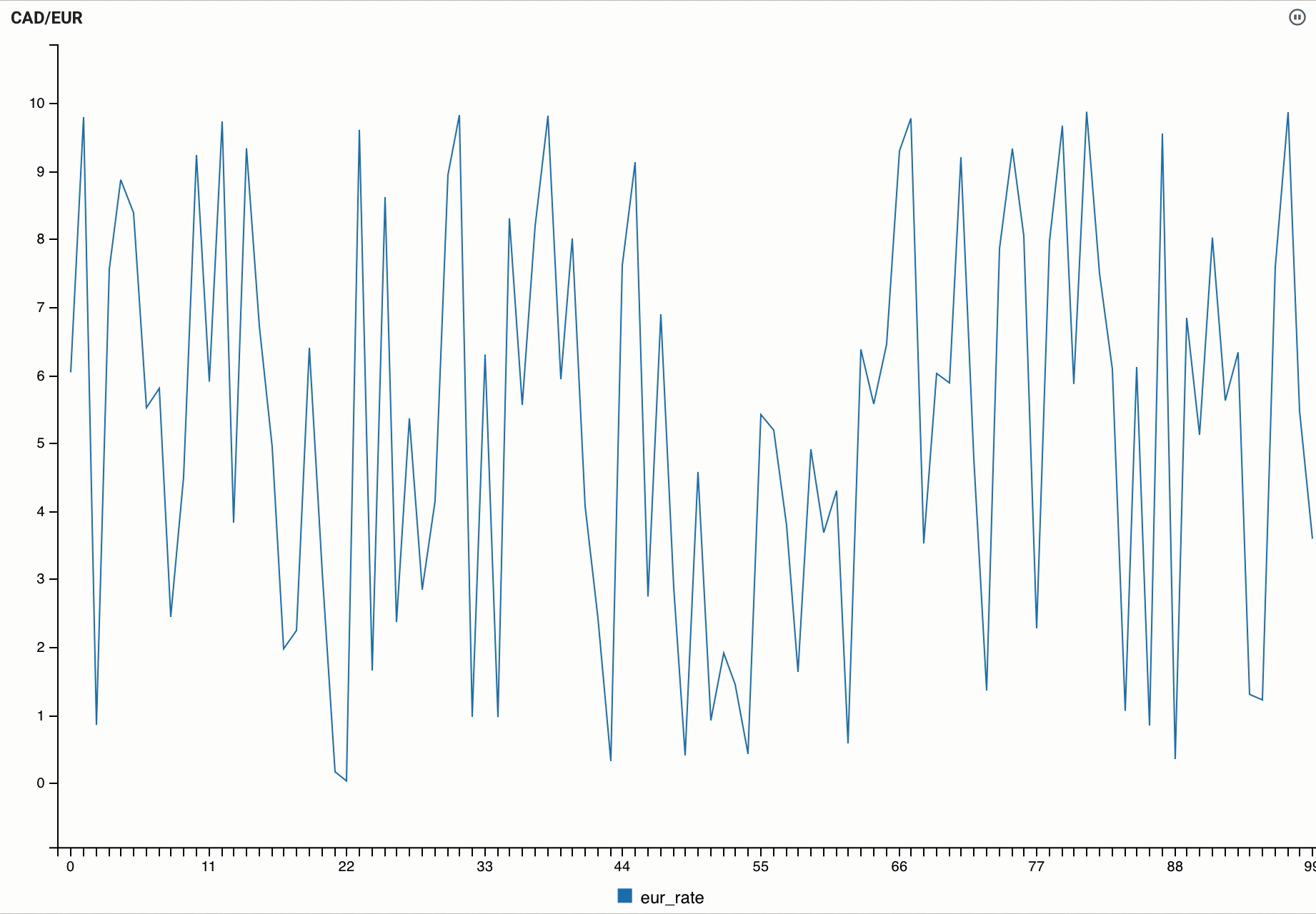
Visualization type: Area
You can use the Area visualization type when you want to show how the values changed over a period of time.
CREATE TABLE currency_rates (
  `currency_code` VARCHAR(2147483647),
  `eur_rate` DECIMAL(6, 4),
  `rate_time` TIMESTAMP(3)
) WITH (
  'fields.currency_code.expression' = '#{Currency.code}',
  'fields.rate_time.expression' = '#{date.past ''15'',''SECONDS''}',
  'connector' = 'faker',
  'rows-per-second' = '100',
  'fields.eur_rate.expression' = '#{Number.randomDouble ''4'',''0'',''10''}'
);

SELECT * FROM currency_rates
WHERE currency_code = 'CAD'| Name | CAD/EUR |
| Data fields | eur_rate |
| Legend poition | Inset |
| Line interpolation | Area |
| Show points | disabled |
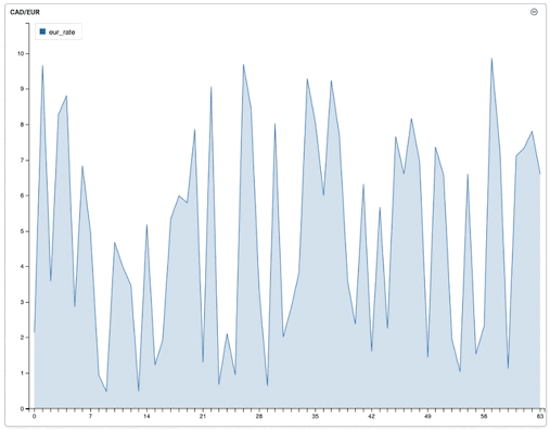
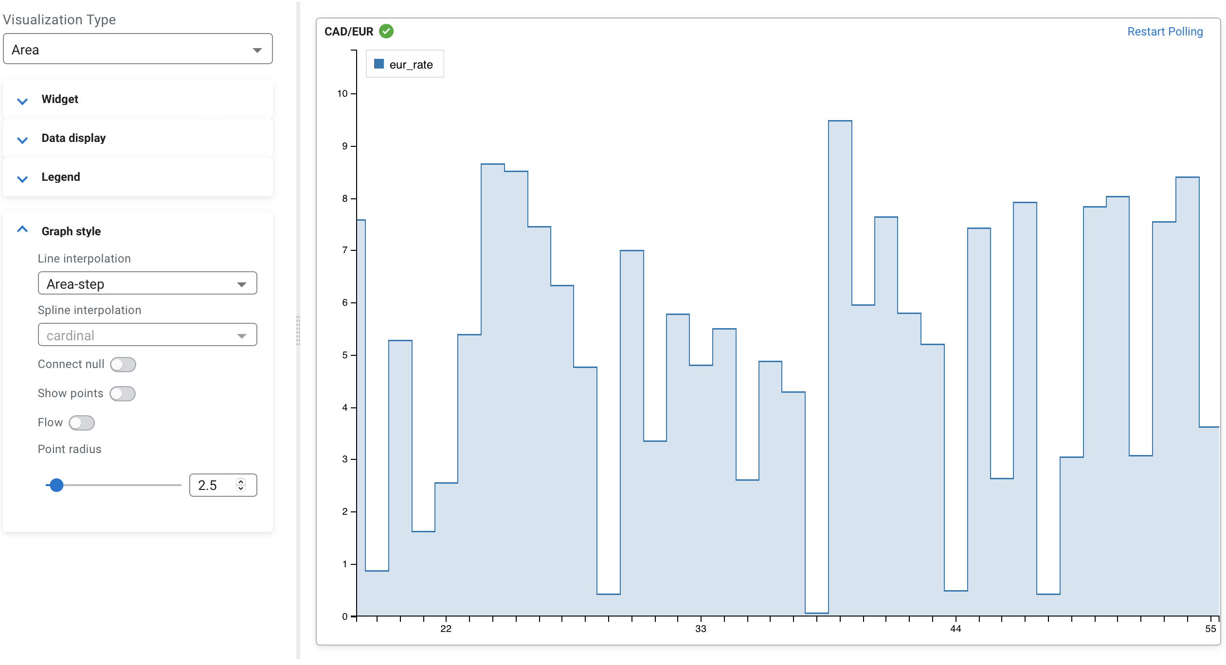
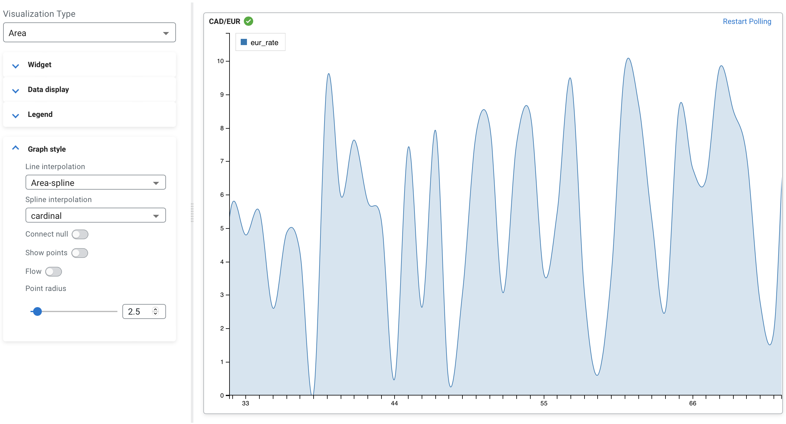
- Line interpolation
- Determines the line interpolation of the visualization. You have the option to select Area-spline and Area-step for line interpolation.
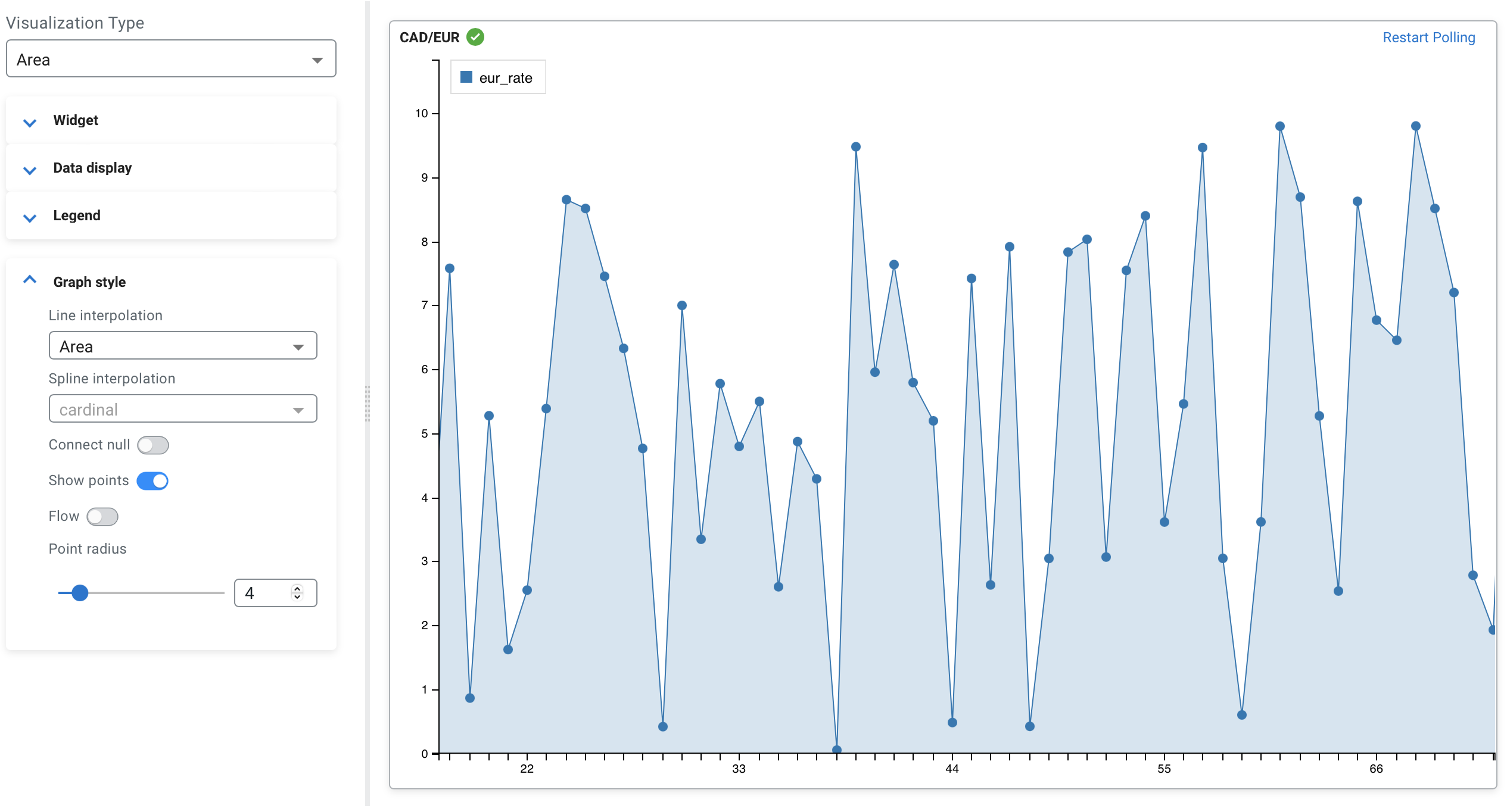
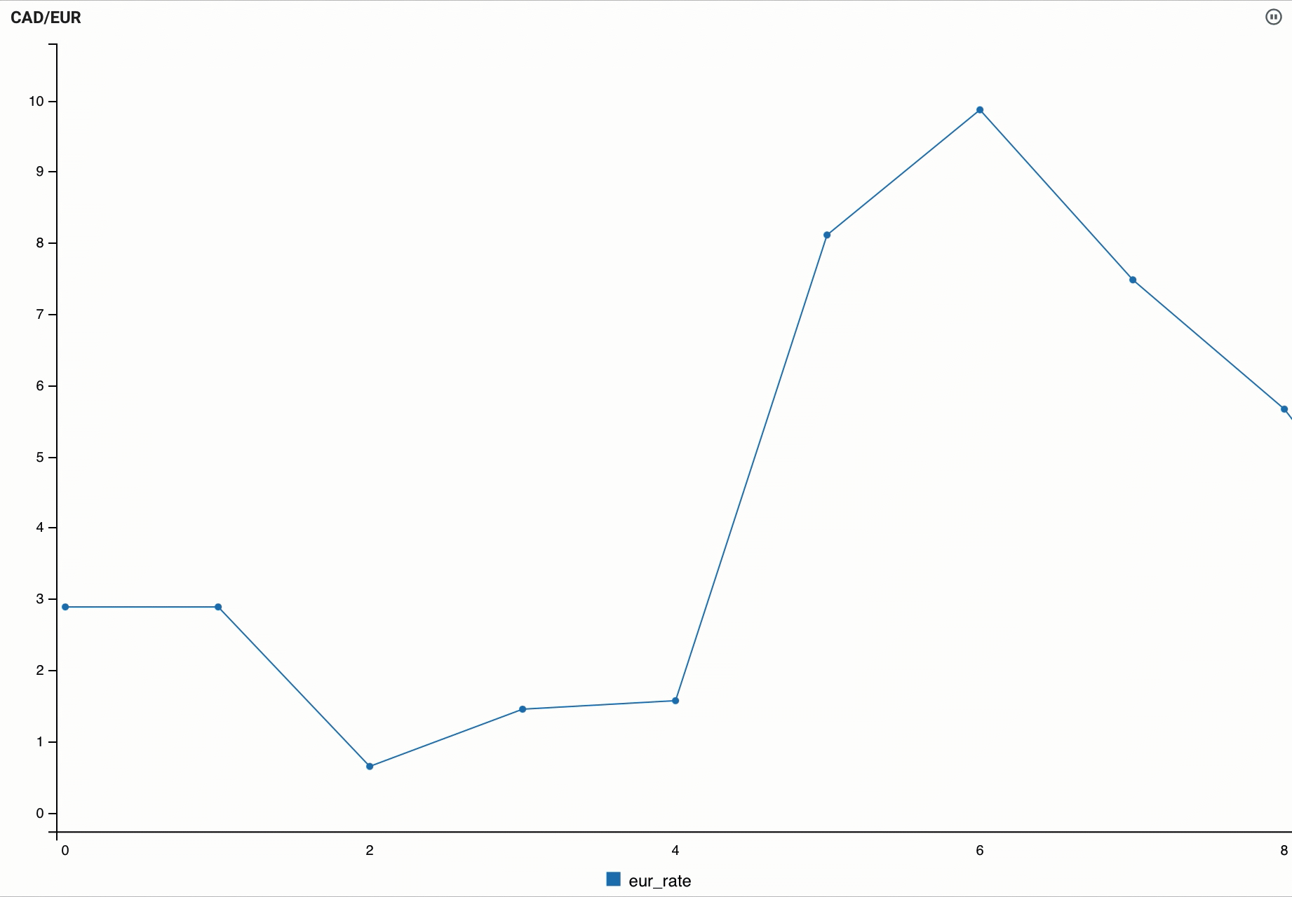
- Show points and Point radius
- You can enable whether to show each data point in line using the Show
points toggle. The size of the points can be changed using the Point
radius configuration, which is set to 2.5 by default. The
following example shows the enabled Show points with 4.0 Point radius:
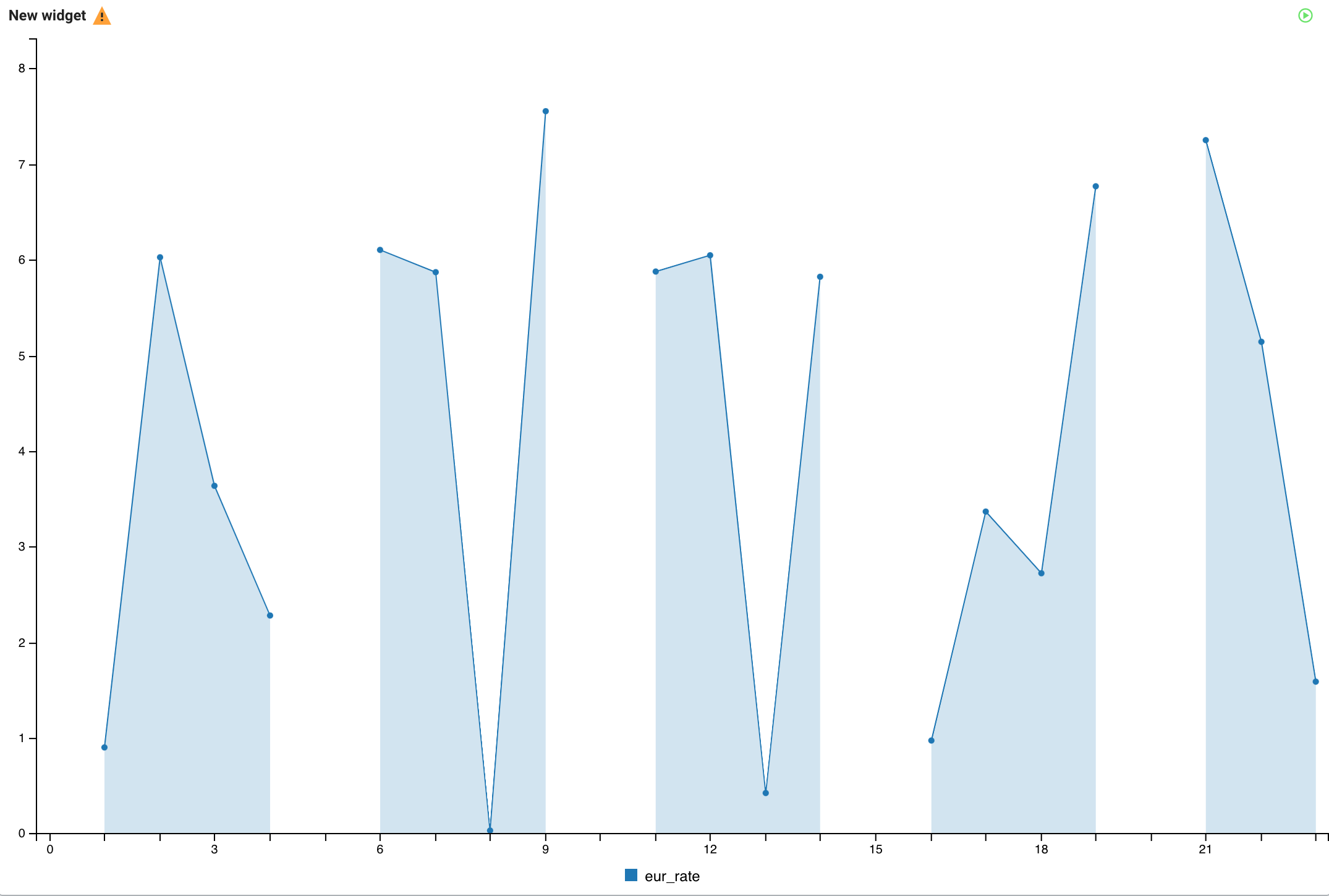
- Connect null
- Using the connect null configuration, you can set if the null data points are connected or
not. If enabled, the region of the null data is connected without any data point. When
disabled, the data points are not connected as shown in the following example:
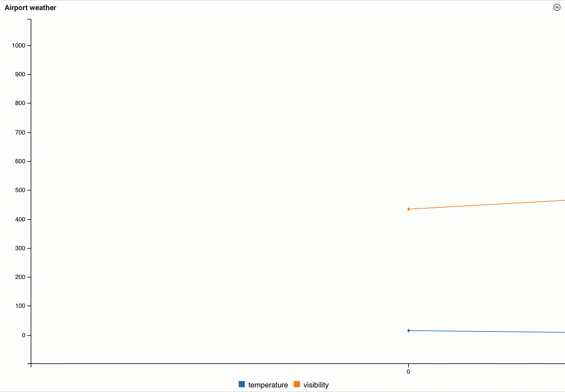
- Flow
- You can set the movement of the data by enabling or disabling the Flow function, which
means the new data points flow to the chart from the right side compared to arriving
periodically as processed on the widget.
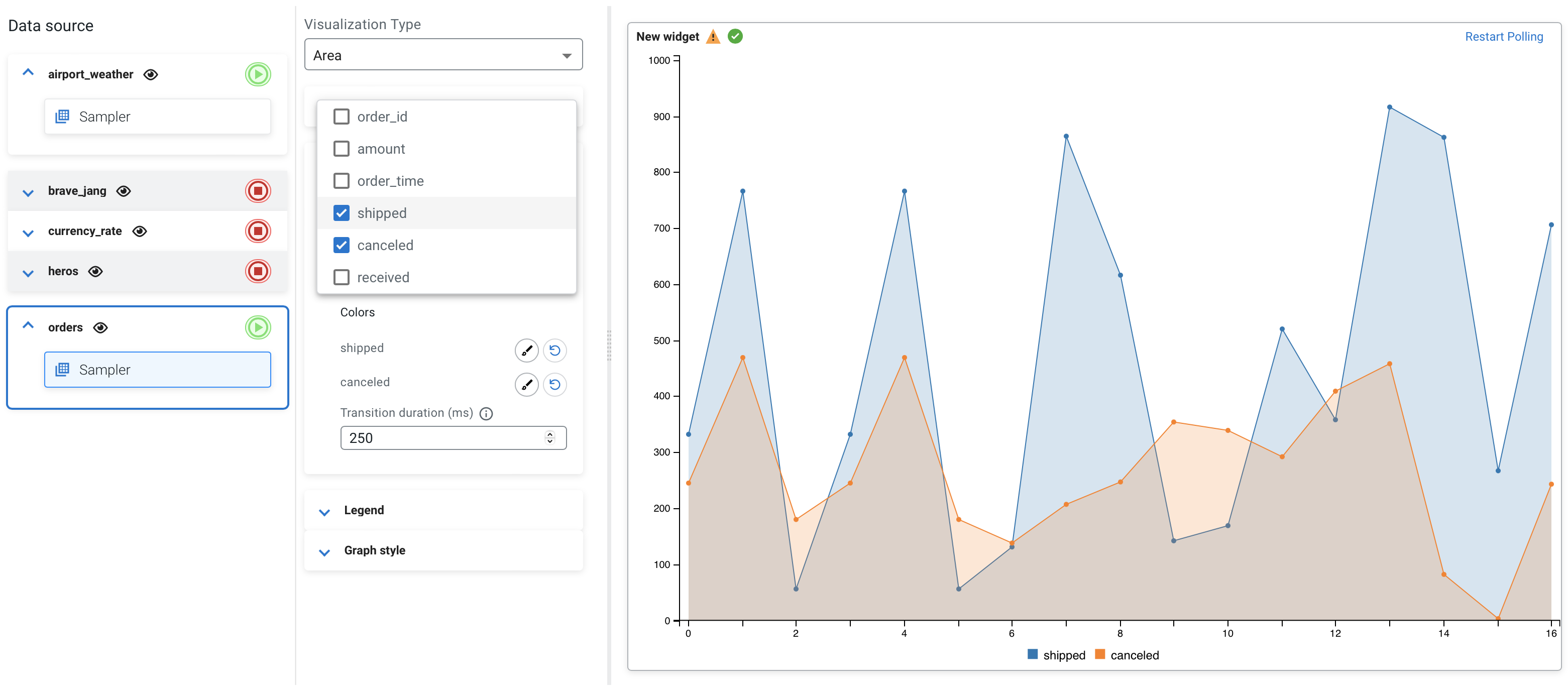
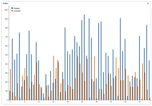
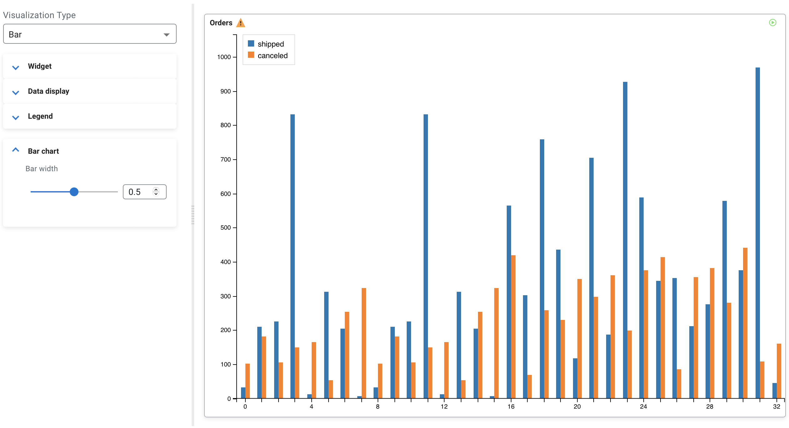
Visualization type: Bar
You can use the Bar visualization type when you want to show how the data is distributed or want to compare the data between different groups.
CREATE TABLE orders (
  `order_id` INT,
  `amount` INT,
  `order_time` TIMESTAMP(3),
  `shipped` VARCHAR(2147483647),
  `canceled` VARCHAR(2147483647),
  `received` VARCHAR(2147483647),
  WATERMARK FOR `order_time` AS `order_time` - INTERVAL '15' SECOND
) WITH (
  'fields.order_time.expression' = '#{date.past ''15'',''SECONDS''}',
  'fields.amount.expression' = '#{number.numberBetween ''0'',''100''}',
  'fields.order_id.expression' = '#{number.numberBetween ''0'',''99999999''}',
  'connector' = 'faker',
  'fields.shipped.expression' = '#{number.numberBetween ''0'',''1000''}',
  'fields.received.expression' = '#{number.numberBetween ''0'',''800''}',
  'fields.canceled.expression' = '#{number.numberBetween ''0'',''500''}',
  'rows-per-second' = '100'
);

SELECT * FROM orders| Name | Orders |
| Data fields | shipped, canceled |
| Legend poition | Inset |
| Bar width | 0.5 |
- Bar width
- You can specify the width of the bars on the widget by changing the default value.
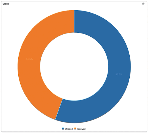
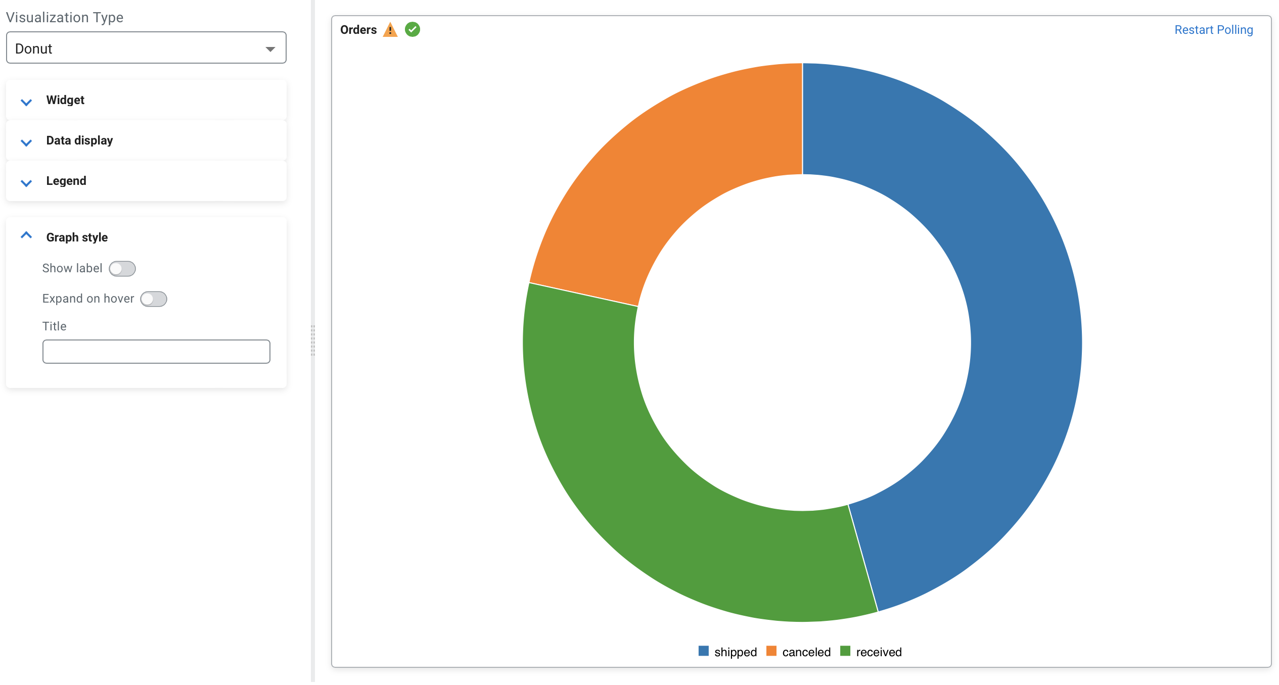
Visualization type: Donut
You can use the Donut visualization type when you want to show the proportions of data within a category where the size of the pieces represent the proportion of each category.
CREATE TABLE orders (
  `order_id` INT,
  `amount` INT,
  `order_time` TIMESTAMP(3),
  `shipped` VARCHAR(2147483647),
  `canceled` VARCHAR(2147483647),
  `received` VARCHAR(2147483647),
  WATERMARK FOR `order_time` AS `order_time` - INTERVAL '15' SECOND
) WITH (
  'fields.order_time.expression' = '#{date.past ''15'',''SECONDS''}',
  'fields.amount.expression' = '#{number.numberBetween ''0'',''100''}',
  'fields.order_id.expression' = '#{number.numberBetween ''0'',''99999999''}',
  'connector' = 'faker',
  'fields.shipped.expression' = '#{number.numberBetween ''0'',''1000''}',
  'fields.received.expression' = '#{number.numberBetween ''0'',''800''}',
  'fields.canceled.expression' = '#{number.numberBetween ''0'',''500''}',
  'rows-per-second' = '100'
);

SELECT * FROM orders| Name | Orders |
| Data fields | shipped, received |
| Legend poition | Bottom |
| Show label | enabled |
- Show label
- You can enable or disable the labels on the visualization as shown in the following
illustration where labels are disabled:
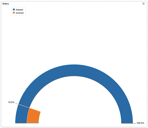
Visualization type: Gauge
You can use the Gauge visualization type when you want to show progress or amount compared to the maximum value.
CREATE TABLE orders (
  `order_id` INT,
  `amount` INT,
  `order_time` TIMESTAMP(3),
  `shipped` VARCHAR(2147483647),
  `canceled` VARCHAR(2147483647),
  `received` VARCHAR(2147483647),
  WATERMARK FOR `order_time` AS `order_time` - INTERVAL '15' SECOND
) WITH (
  'fields.order_time.expression' = '#{date.past ''15'',''SECONDS''}',
  'fields.amount.expression' = '#{number.numberBetween ''0'',''100''}',
  'fields.order_id.expression' = '#{number.numberBetween ''0'',''99999999''}',
  'connector' = 'faker',
  'fields.shipped.expression' = '#{number.numberBetween ''0'',''1000''}',
  'fields.received.expression' = '#{number.numberBetween ''0'',''800''}',
  'fields.canceled.expression' = '#{number.numberBetween ''0'',''500''}',
  'rows-per-second' = '100'
);

SELECT * FROM orders| Name | Orders |
| Data fields | shipped, received |
| Legend poition | Inset |
| Reducer | Last |
| Show label | enabled |
| Min | 100 |
| Max | 300 |
- Reducer
- A reducer function that will be used to reduce many fields to a single value. You have
the following options to choose from:
- Last
- First
- Min
- Max
- Total
- All
- Min, Max
- You can specify the minimum and maximum value of the gauge chart.
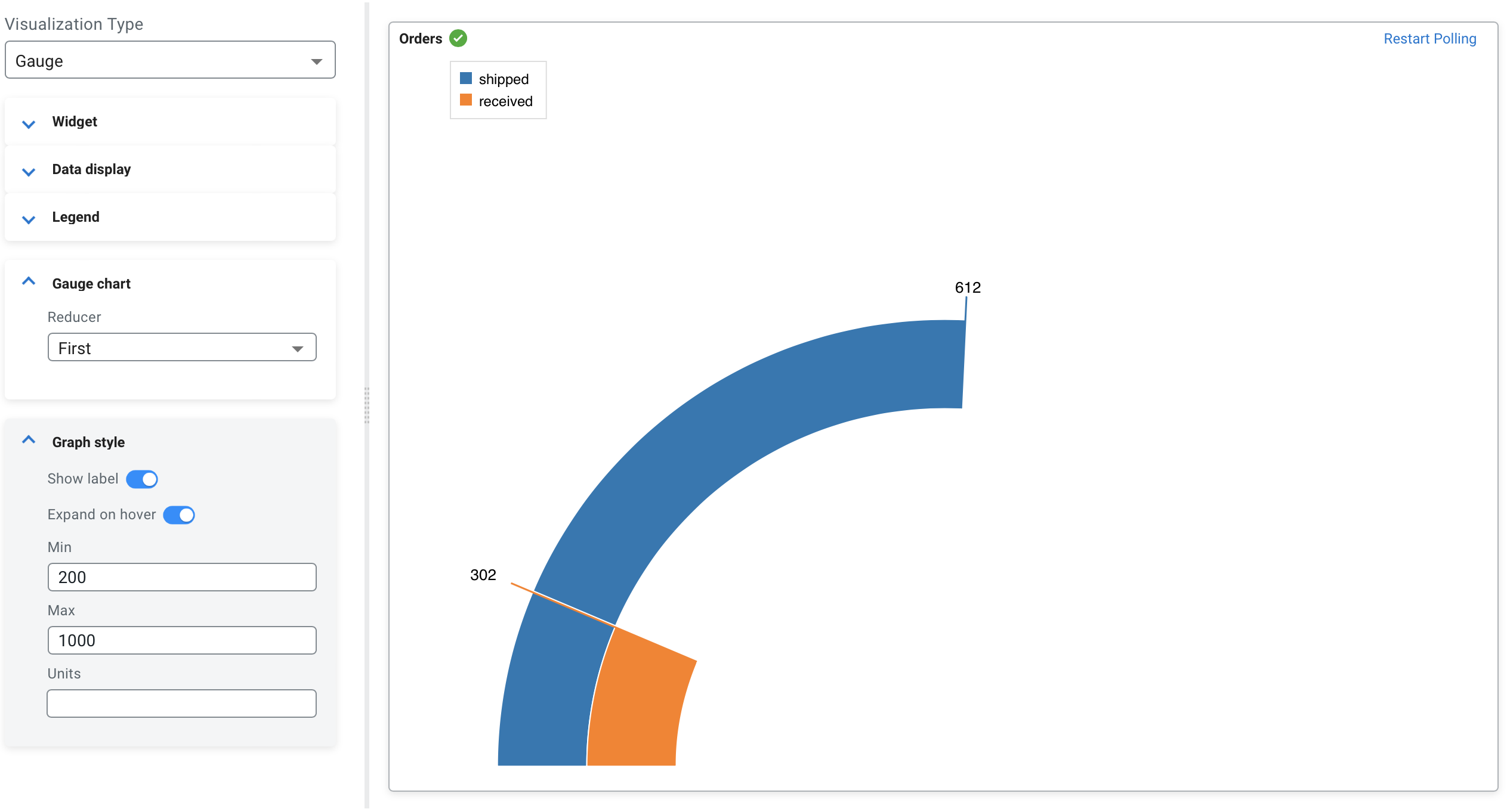
- Show label
- You can enable or disable the labels on the visualization to be shown or not.
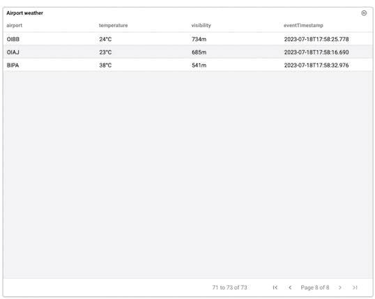
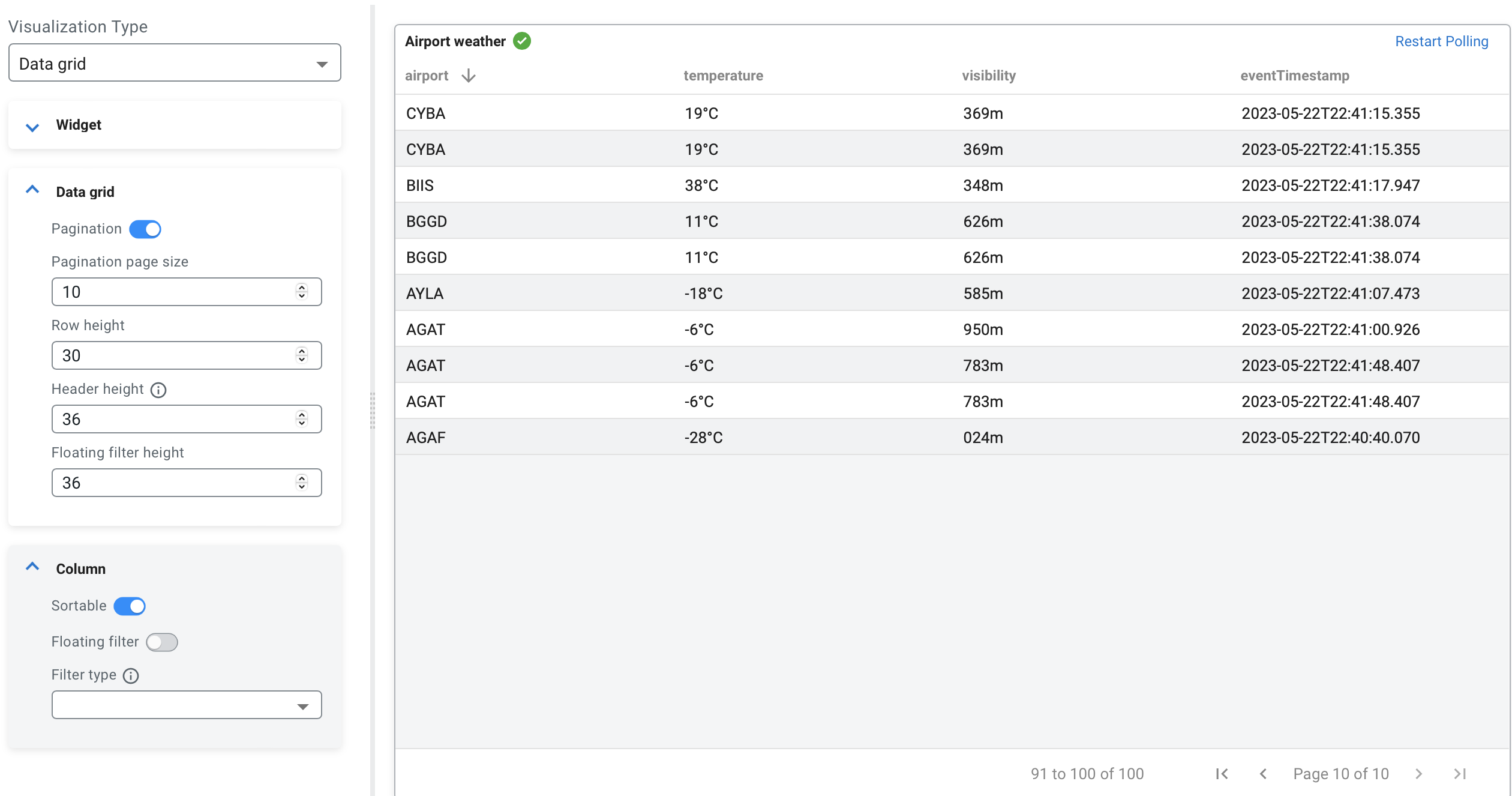
Visualization type: Data grid
You can use the Data grid visualization type when you want to show data in a table format.
CREATE TABLE airport_weather (
  `airport` VARCHAR(2147483647) NOT NULL,
  `temperature` VARCHAR(2147483647) NOT NULL,
  `visibility` VARCHAR(2147483647) NOT NULL,
  `eventTimestamp` TIMESTAMP(3),
  WATERMARK FOR `eventTimestamp` AS `eventTimestamp` - INTERVAL '30' SECOND,
  CONSTRAINT `PK_-991666966` PRIMARY KEY (`airport`) NOT ENFORCED
) WITH (
  'fields.eventTimestamp.expression' = '#{date.past ''30'',''SECONDS''}',
  'connector' = 'faker',
  'fields.temperature.expression' = '#{Weather.temperatureCelsius}',
  'fields.airport.expression' = '#{Aviation.airport}',
  'rows-per-second' = '100',
  'fields.visibility.expression' = '#{numerify ''###m''}'
);

SELECT * FROM airport_weather| Name | Airport weather |
| Pagination | enabled |
| Page size | 10 |
| Row height | 30 |
| Header height | 36 |
| Sortable | disabled |
- Pagination and pagination page size
- You can enable and disable the pagination of the data on the visualization where the
page size provides the number of rows displayed.
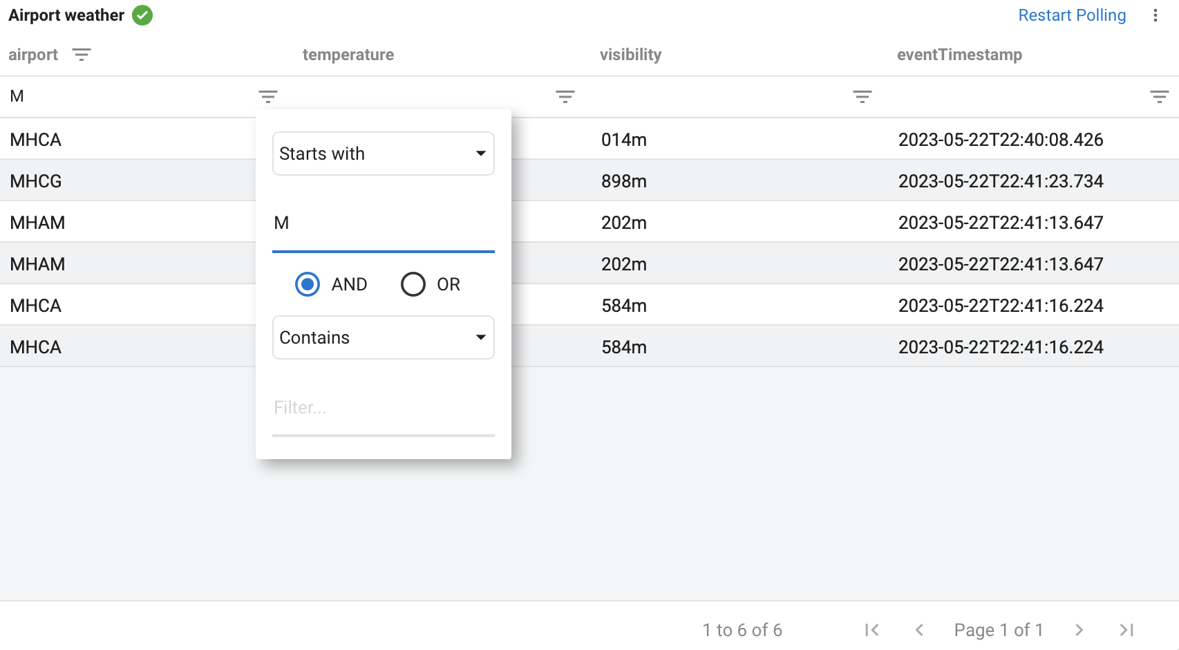
- Floating filter and floating filter height:
- You can add floating filter to the data grid which enables text, number or date based
filtering of the columns. For example, you can set the floating filter to text and
filter the data to start with M:
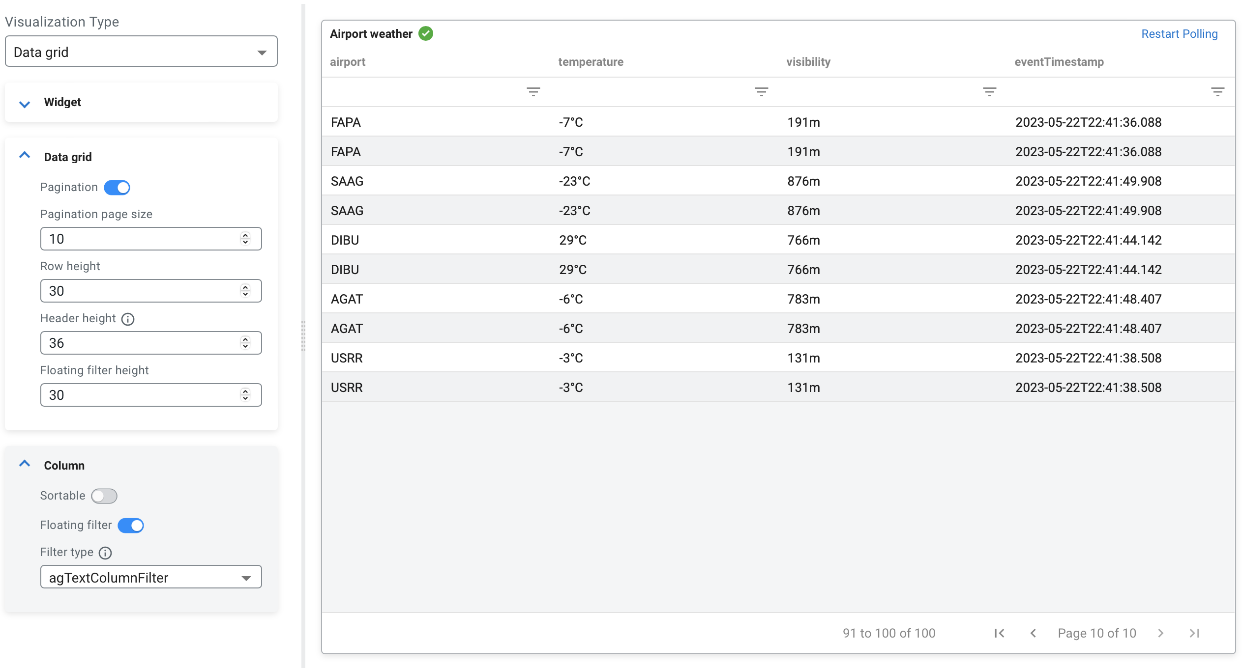
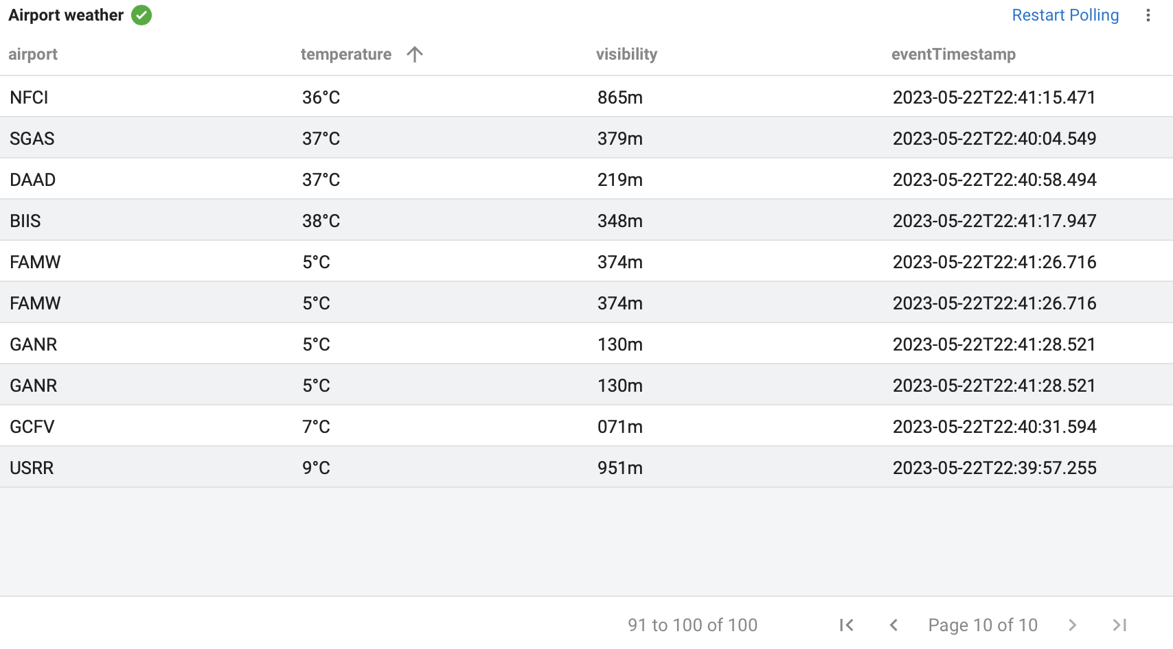
- Sortable
- You can enable or disable sortable columns for the data grid. You can sort the data in
the filtered column by clicking on the column name so the values are in increasing or
decreasing order.
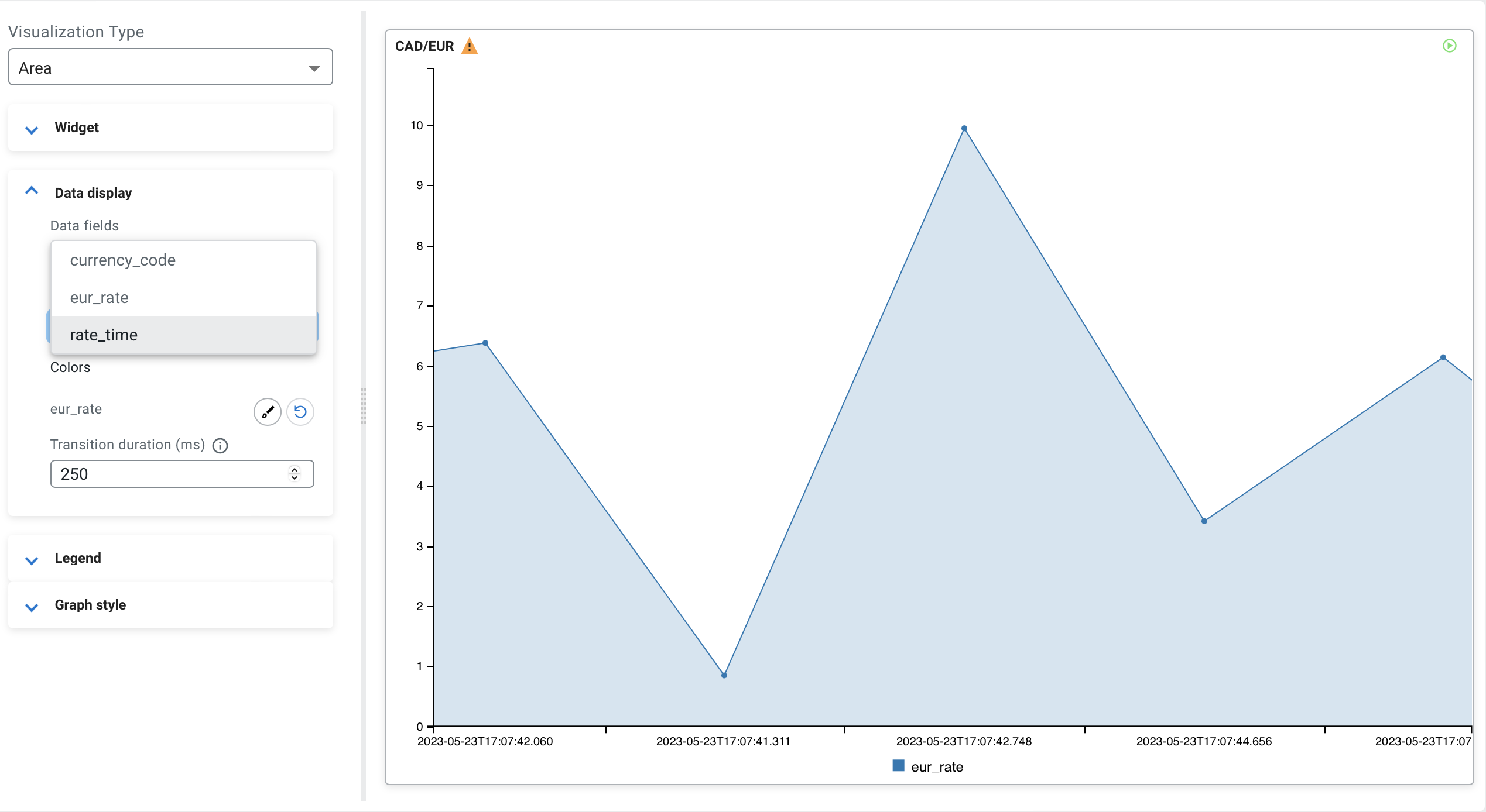
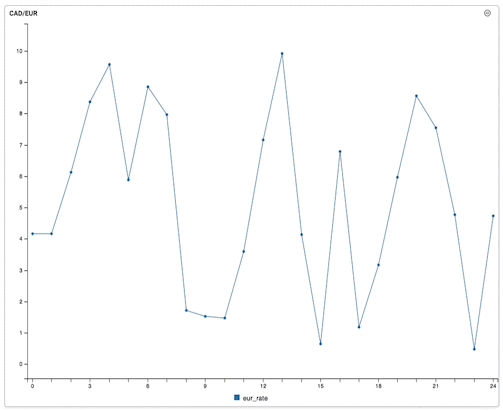
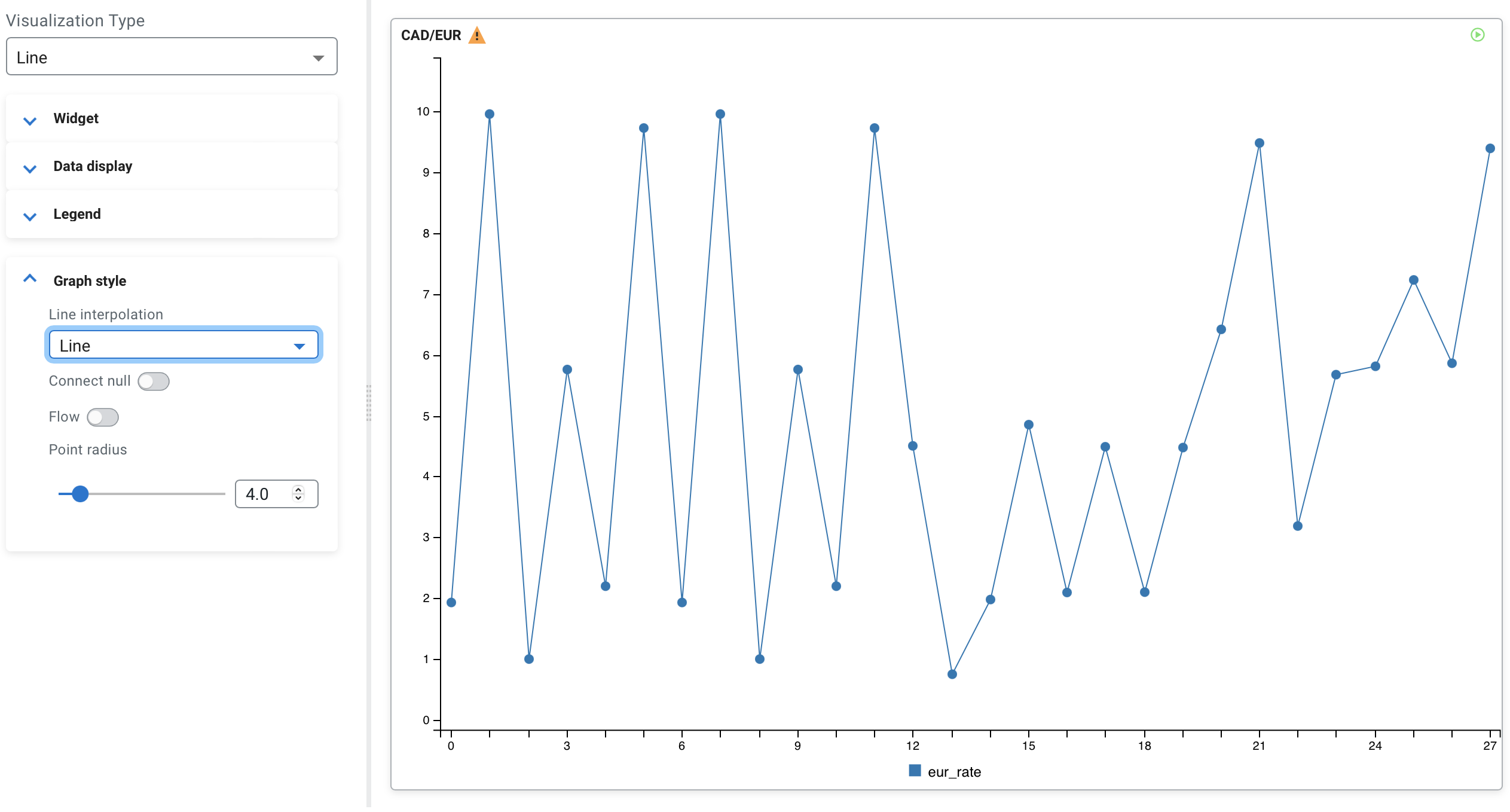
Visualization type: Line
You can use the Line visualization type when you want to show how the values changed over a period of time
CREATE TABLE currency_rates (
  `currency_code` VARCHAR(2147483647),
  `eur_rate` DECIMAL(6, 4),
  `rate_time` TIMESTAMP(3)
) WITH (
  'fields.currency_code.expression' = '#{Currency.code}',
  'fields.rate_time.expression' = '#{date.past ''15'',''SECONDS''}',
  'connector' = 'faker',
  'rows-per-second' = '100',
  'fields.eur_rate.expression' = '#{Number.randomDouble ''4'',''0'',''10''}'
);

SELECT * FROM currency_rates
WHERE currency_code = 'CAD'| Name | CAD/EUR |
| Data fields | eur_rate |
| Legend poition | Bottom |
| Line interpolation | Line |
| Point radius | 2.5 |
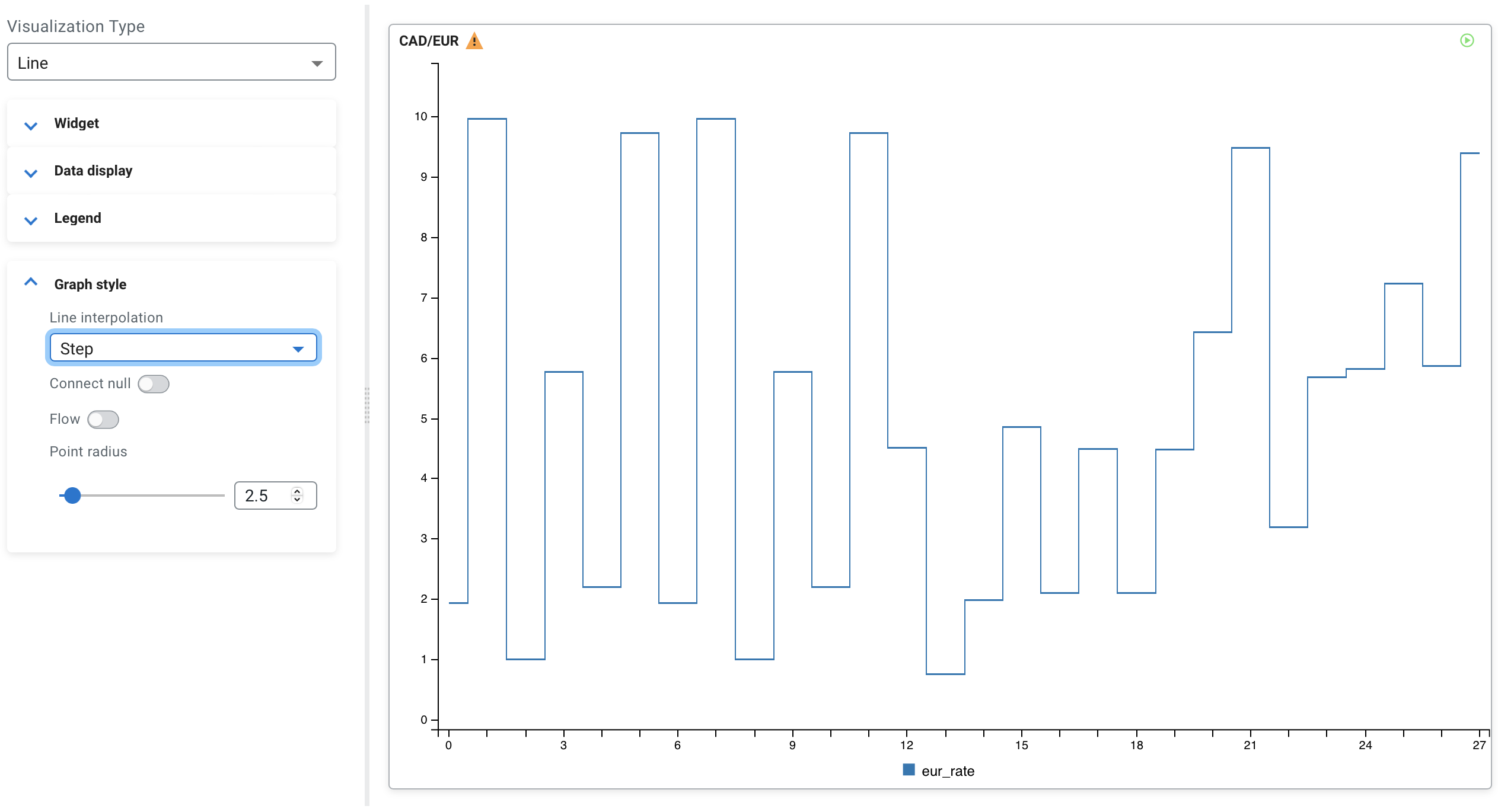
- Line interpolation
- Determines the line interpolation of the visualization. You have the option to select Step
as well as the interpolation as shown in the following example:
- Point radius
- You can enable whether to show each data point in line using the Show
points toggle. The size of the points can be changed using the
Point radius configuration, which is set to
2.5 by default. The following example shows the enabled Show
points with 4.0 Point radius:
- Connect null
- Using the connect null configuration, you can set if the null data points are
connected or not. If enabled, the region of the null data is connected without any data
point. When disabled, the data points are not connected as shown in the following
example:
- Flow
- You can set the movement of the data by enabling or disabling the Flow function, which
means the new data points flow to the chart from the right side compared to arriving
periodically as processed on the widget.
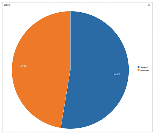
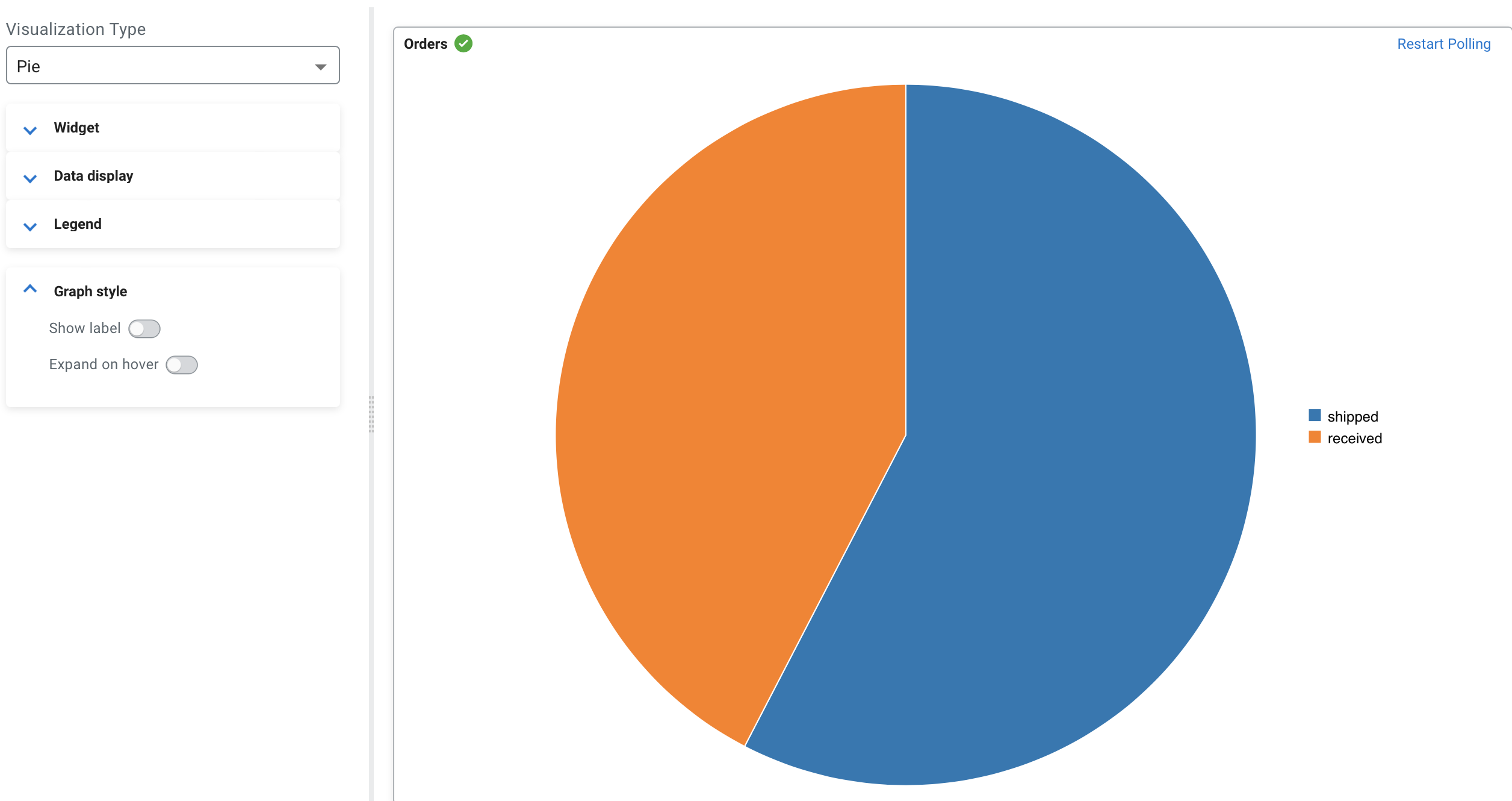
Visualization type: Pie
You can use the Pie visualization type when you want to show data as a percentage compared to the whole dataset where each slice of the pie represents a category of data.
CREATE TABLE orders (
  `order_id` INT,
  `amount` INT,
  `order_time` TIMESTAMP(3),
  `shipped` VARCHAR(2147483647),
  `canceled` VARCHAR(2147483647),
  `received` VARCHAR(2147483647),
  WATERMARK FOR `order_time` AS `order_time` - INTERVAL '15' SECOND
) WITH (
  'fields.order_time.expression' = '#{date.past ''15'',''SECONDS''}',
  'fields.amount.expression' = '#{number.numberBetween ''0'',''100''}',
  'fields.order_id.expression' = '#{number.numberBetween ''0'',''99999999''}',
  'connector' = 'faker',
  'fields.shipped.expression' = '#{number.numberBetween ''0'',''1000''}',
  'fields.received.expression' = '#{number.numberBetween ''0'',''800''}',
  'fields.canceled.expression' = '#{number.numberBetween ''0'',''500''}',
  'rows-per-second' = '100'
);

SELECT * FROM orders| Name | Orders |
| Data fields | shipped, received |
| Legend poition | Right |
| Show label | enabled |
- Show label
- You can enable or disable the labels on the visualization as shown in the following
illustration where labels are disabled:
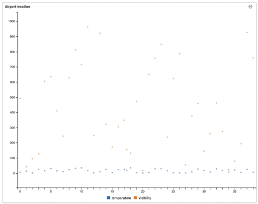
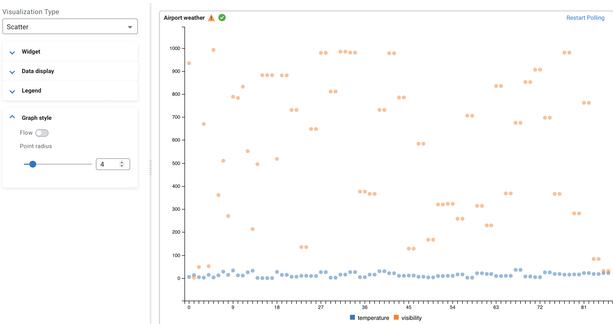
Visualization type: Scatter
You can use the Scatter visualization type when you want to show the correlation between different datasets.
CREATE TABLE airport_weather (
  `airport` VARCHAR(2147483647) NOT NULL,
  `temperature` VARCHAR(2147483647) NOT NULL,
  `visibility` VARCHAR(2147483647) NOT NULL,
  `eventTimestamp` TIMESTAMP(3),
  WATERMARK FOR `eventTimestamp` AS `eventTimestamp` - INTERVAL '30' SECOND,
  CONSTRAINT `PK_-991666966` PRIMARY KEY (`airport`) NOT ENFORCED
) WITH (
  'fields.eventTimestamp.expression' = '#{date.past ''30'',''SECONDS''}',
  'connector' = 'faker',
  'fields.temperature.expression' = '#{Weather.temperatureCelsius}',
  'fields.airport.expression' = '#{Aviation.airport}',
  'rows-per-second' = '100',
  'fields.visibility.expression' = '#{numerify ''###m''}'
);

SELECT * FROM airport_weather| Name | Airport weather |
| Data fields | temperature, visibility |
| Legend poition | Bottom |
| Point radius | 2.5 |
- Point radius
- You can enable whether to show each data point in line using the Show
points toggle. The size of the points can be changed using the
Point radius configuration, which is set to
2.5 by default. The following example shows the enabled Show
points with 4.0 Point radius:
- Flow
- You can set the movement of the data by enabling or disabling the Flow function, which
means the new data points flow to the chart from the right side compared to arriving
periodically as processed on the widget.
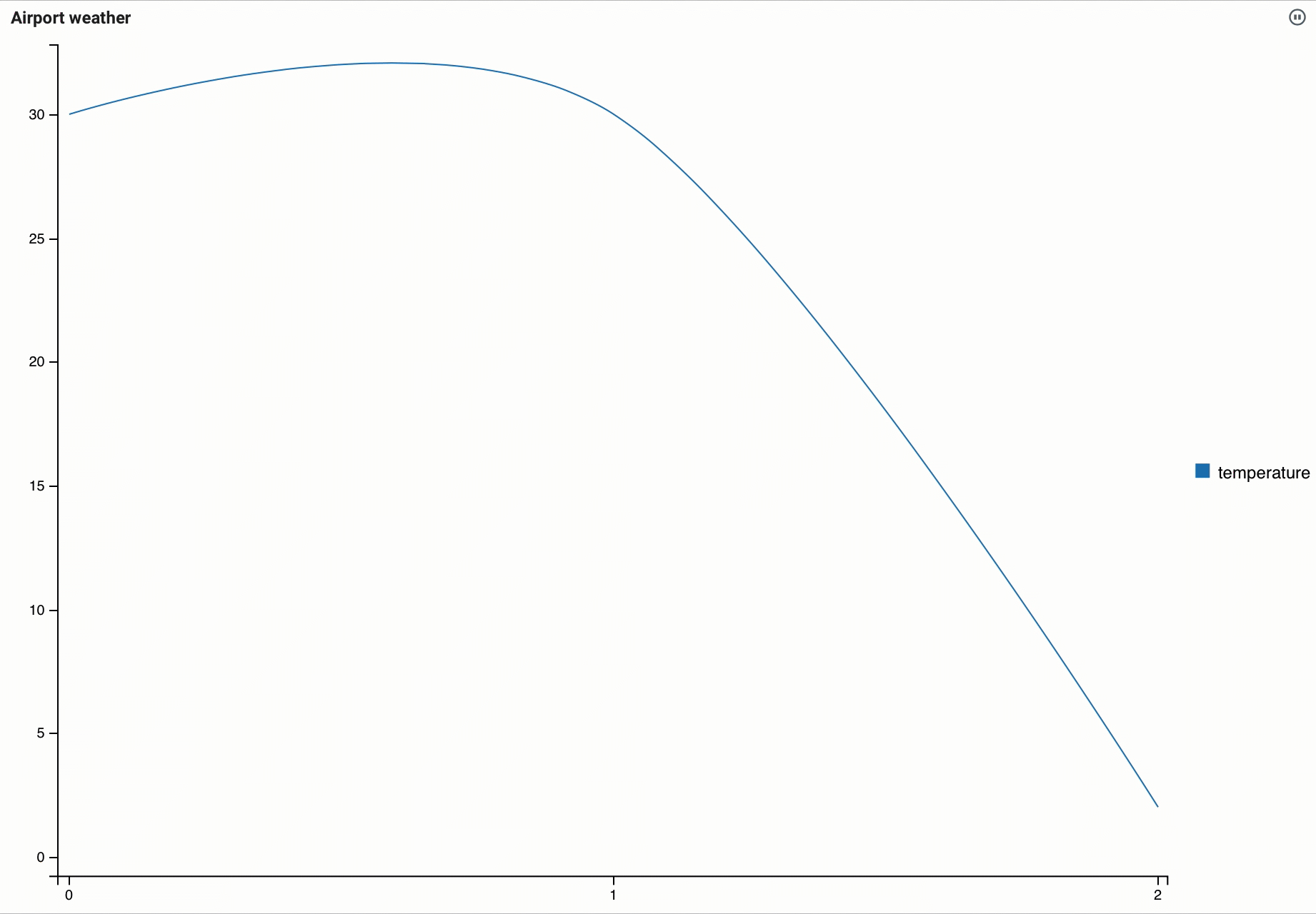
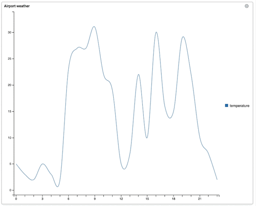
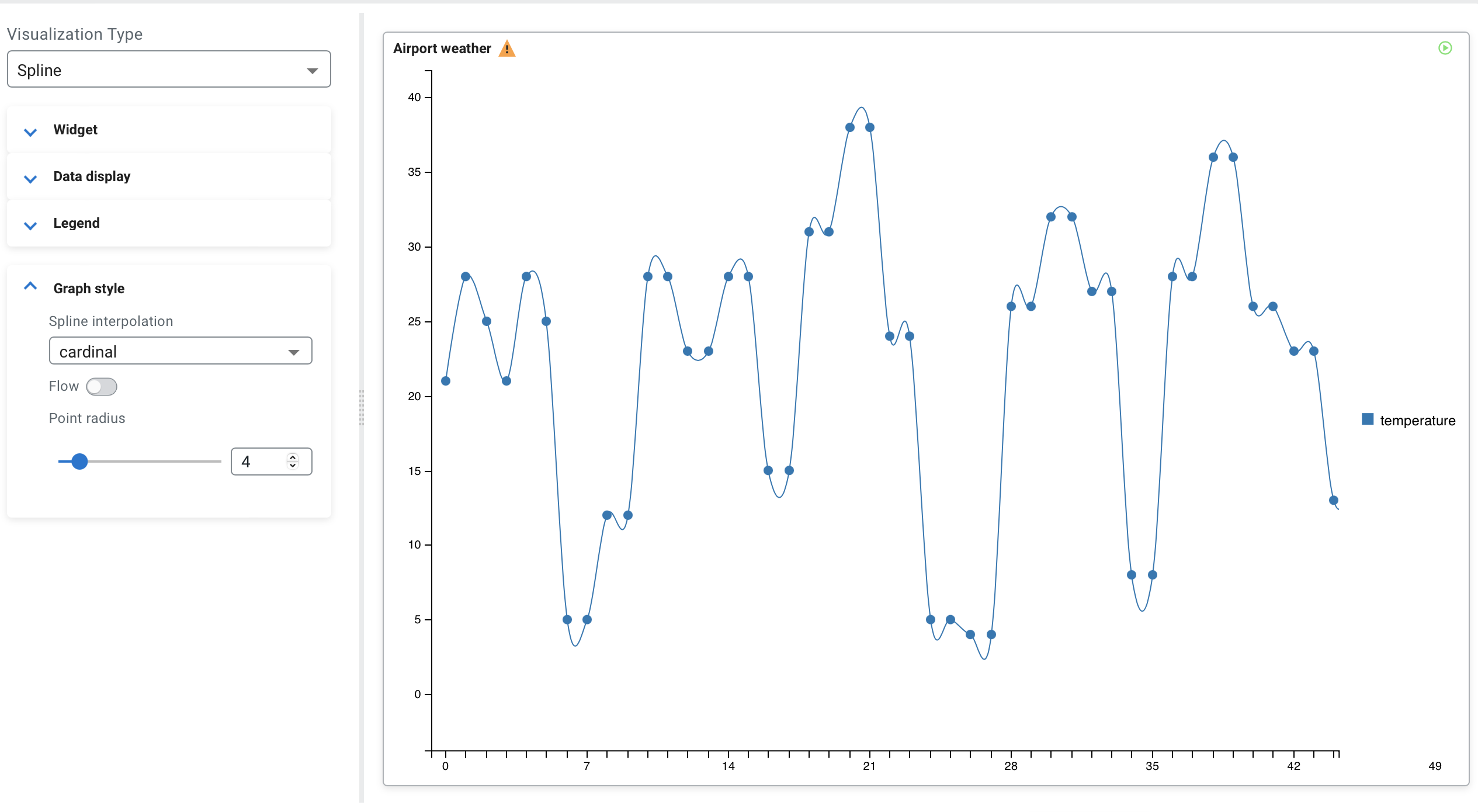
Visualization type: Spline
You can use the Spline visualization type when you want to show how the data changed over a period of time where the trends of change are emphasized.
CREATE TABLE airport_weather (
  `airport` VARCHAR(2147483647) NOT NULL,
  `temperature` VARCHAR(2147483647) NOT NULL,
  `visibility` VARCHAR(2147483647) NOT NULL,
  `eventTimestamp` TIMESTAMP(3),
  WATERMARK FOR `eventTimestamp` AS `eventTimestamp` - INTERVAL '30' SECOND,
  CONSTRAINT `PK_-991666966` PRIMARY KEY (`airport`) NOT ENFORCED
) WITH (
  'fields.eventTimestamp.expression' = '#{date.past ''30'',''SECONDS''}',
  'connector' = 'faker',
  'fields.temperature.expression' = '#{Weather.temperatureCelsius}',
  'fields.airport.expression' = '#{Aviation.airport}',
  'rows-per-second' = '100',
  'fields.visibility.expression' = '#{numerify ''###m''}'
);

SELECT * FROM airport_weather
WHERE airport = 'BIPA'| Name | Airport weather |
| Data fields | temperature |
| Legend poition | Right |
| Spline interpolation | cardinal |
| Point radius | 0 |
- Line interpolation
- You can specify the Spline interpolation which includes the following list of
options:
- Linear, linear-closed
- Basis, basis-open, basis-closed
- Cardinal, cardinal-open, cardinal-closed
- Monotone
- Step, step-before, step-after
- Point radius
- You can enable whether to show each data point in line using the Show
points toggle. The size of the points can be changed using the
Point radius configuration, which is set to
2.5 by default. The following example shows the enabled Show
points with 4.0 Point radius:
- Flow
- You can set the movement of the data by enabling or disabling the Flow function, which
means the new data points flow to the chart from the right side compared to arriving
periodically as processed on the widget.