Charting Time-Series Data
Cloudera Manager enables you to enter a query for a time series, chart the time-series data, group (facet) individual time series if your query produced multiple time series, and save the results as a dashboard.
The following sections have more details on the terminology used, how to query for time-series data, displaying chart details, editing charts, and modifying chart properties.
Terminology
Entity
A Cloudera Manager component that has metrics associated with it, such as a service, role, or host.Metric
A property that can be measured to quantify the state of an entity or activity, such as the number of open file descriptors or CPU utilization percentage. For a list of all the metrics supported by Cloudera Manager, see Cloudera Manager Metrics.Building a Chart with Time-Series Data
- Select .
- Display time series in one of the following ways:
- Select a recently used statement
- Click the
 to the right of the Build Chart button to
display a list of recently run statements and select a statement. The statement text displays in the text box and the chart(s) that display that time series will display.
to the right of the Build Chart button to
display a list of recently run statements and select a statement. The statement text displays in the text box and the chart(s) that display that time series will display.
- Click the
- Select from the list of Chart Examples
- Click the question mark icon
 to the right of the Build Chart
button to display a list of examples with descriptions.
to the right of the Build Chart
button to display a list of examples with descriptions. - Click Try it to create a chart based on the statement text in the example.
- Click the question mark icon
- Type a new statement
- Press Spacebar in the text box. tsquery statement components display in a drop-down list. These suggestions are part of type ahead, which helps build valid queries. Scroll to the desired component and click Enter. Continue choosing query components by pressing Spacebar and Enter until the tsquery statement is complete.
- Select a recently used statement
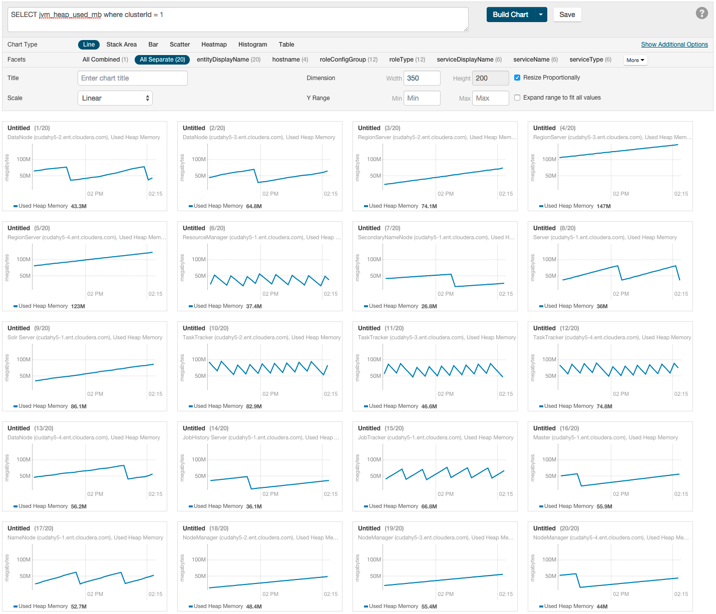
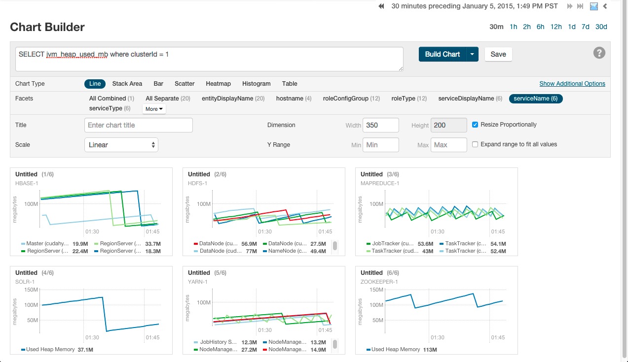
For example, the query SELECT jvm_heap_used_mb where clusterId = 1 could return a set of charts like the following:
Configuring Time-Series Query Results
Minimum Required Role: Configurator (also provided by Cluster Administrator, Full Administrator)
A time-series query returns one or more time series or scalar values. By default a maximum of 250 time series will be returned.
- Select .
- In the Advanced category, set the Maximum Number Of Time-Series Streams Returned Per Time-Series Query or the Maximum Number of Time-Series Streams Returned Per Heatmap property.
- Click Save Changes.
Using Context-Sensitive Variables in Charts
When editing charts from a service, role or host status or charts page, or when adding a chart to a status page, a set of context-sensitive variables (each beginning with '$') will be displayed below the query box on the Chart Builder page. For example, you might see variables similar to those in the query below:

Notice the $HOSTNAME portion of the query string. $HOSTNAME is a variable that will be resolved to a specific value based on the page before the query is actually issued. In this case, $HOSTNAME will become nightly53-2.ent.cloudera.com.
The chart below shows an example of the output of a similar query.
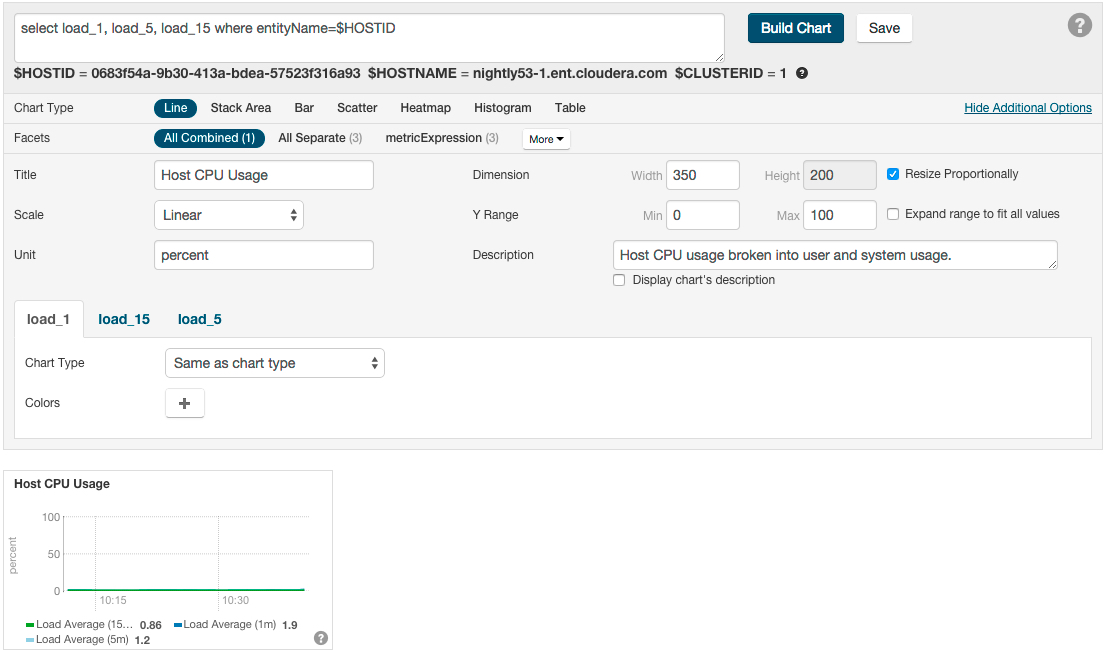
Context-sensitive variables are useful since they allow portable queries to be written. For example the query above may be on the host status page or any role status page to display the appropriate host's swap rate. Variables cannot be used in queries that are part of user-defined dashboards since those dashboards have no service, role or host context.
Chart Properties
By default, the time-series data retrieved by the tsquery is displayed on its own chart, using a Line style chart, a default size, and a default minimum and maximum for the Y-axis. You can change the chart type, facet the data, set the chart scale and size, and set X- and Y-axis ranges.
Changing the Chart Type
- Line - Displays the points in the time series as continuous line.
- Stack Area - Displays the points in the time series as continuous line and the area under the line filled in.
- Bar - Displays each the value of the metric averaged over a second as a bar.
- Scatter - Displays the points in the time series as dots.
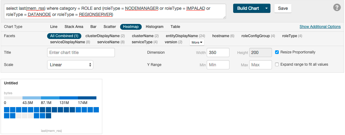
- Heatmap - Displays a metric thermometer and grid of colored squares. The thermometer displays buckets that represent a range of metric values and a color
coding for the bucket. Each square represents an entity and the color of the square represents the value of a metric within a range. The following heatmap shows the last value of the resident memory
for the NodeManager, ImpalaD, DataNode, and RegionServer roles.
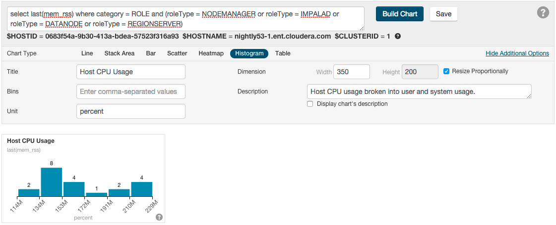
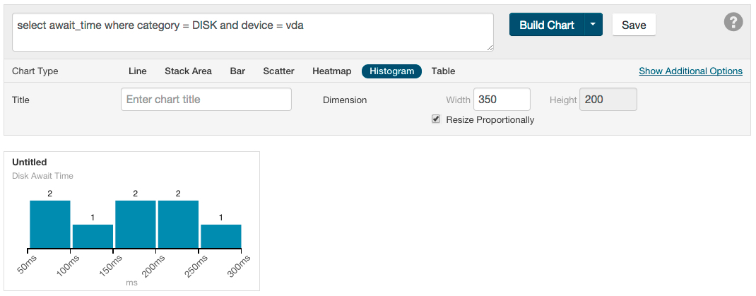
- Histogram - Displays the time series values as a set of bars where each bar represents a range of metric values and the height of the bar represents the
number of entities whose value falls within the range. The following histogram shows the number of roles in each range of the last value of the resident memory.
- Table - Displays the time series values as a table with each row containing the data for a single time value.
Grouping (Faceting) Time Series
A time-series plot for a service, role, or host may actually be a composite of multiple individual time series. For example, the query SELECT jvm_heap_used_mb where clusterId = 1 returns time-series data for the JVM heap used. Each time series has hostname, role type, metric, and entity name attributes. By default each attribute is displayed all on a single chart.
Using facets, you can combine time series based their attributes. To change the organization of the chart data, click one of the facets in the facet section in the upper part of the
screen. The number in parentheses indicates how many charts will be displayed for that facet. As shown in the image below if the serviceName facet is selected for
the JVM heap query, the time series is grouped into six charts, one chart each for each service name. The charts for service types with multiple roles contain multiple lines (for example, HBase,
HDFS) while services that have only one role (for example, ZooKeeper) contain just a single line. When a chart contains multiple lines, each entity is identified by a different color line.
Changing Dimensions
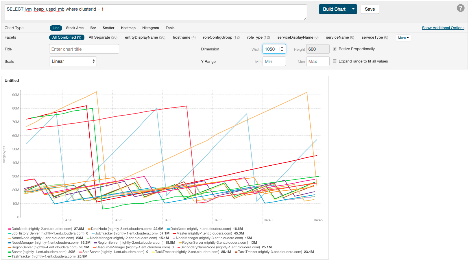
You can change the size of your charts by modifying the values in the Dimension fields. They change in 50-pixel increments when you click the up or down arrows, and you can type values in as long as they are multiples of 50. If you have multiple charts, depending on the dimensions you specify and the size of your browser window, your charts may appear in rows of multiple charts. If the Resize Proportionally checkbox is checked, you can modify one dimension and the other will be modified automatically to maintain the chart's width and height proportions.
The following chart shows the same query as the previous chart, but with All Combined selected (which shows all time series in a single chart) and with the
Dimension values increased to expand the chart.
Changing Axes
You can change the Y-axis range using the Y Range minimum and maximum fields.
The X-axis is based on clock time, and by default shows the last hour of data. You can use the Time Range Selector or a duration link (  ) to set the time range. (See Time Line for details).
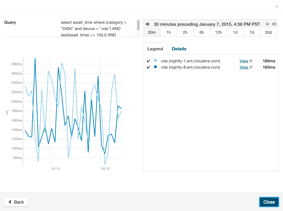
Displaying Chart Details
When you move your mouse over a chart, its background turns gray, indicating that you can act upon it.
- Moving the mouse to a data point on a line, stack area, or bar chart shows the details about that data point in a pop-up tooltip.
- Click a line, stack area, scatter, or bar chart to expand it into a full-page view with a legend for the individual charted
entities as well more fine-grained axes divisions.
- If there are multiple entities in the chart, you can
- Check and uncheck the legend item to hide or show the time series for the entities on the chart.

- If there are service, role, or host instances in the chart, click the
 View link to display the instance's Status page.
- Check and uncheck the legend item to hide or show the time series for the entities on the chart.
- Click the Close button to return to the regular chart view.
- If there are multiple entities in the chart, you can
- Heatmap - Clicking a square in a heatmap displays a line chart of the time series for that entity.
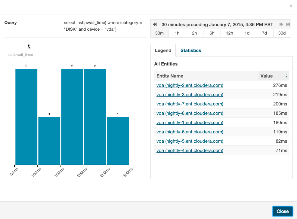
- Histogram -
- Mousing over the upper right corner of a histogram and clicking
 opens a pop-up
containing the query that generated the chart, an expanded view of the chart, a list of entity names and links to the entities whose metrics are represented by the histogram bars, and the value of
the metric for each entity. For example, clicking the following histogram
opens a pop-up
containing the query that generated the chart, an expanded view of the chart, a list of entity names and links to the entities whose metrics are represented by the histogram bars, and the value of
the metric for each entity. For example, clicking the following histogram
displays the following:
- Clicking a bar in the expanded histogram displays a line chart of the time series from which the histogram was generated:
Clicking the < Back link at the bottom left of the line chart returns to the expanded histogram.
- Mousing over the upper right corner of a histogram and clicking
Editing a Chart
You can edit a chart from the custom dashboard and save it back into the same or another existing dashboard, or to a new custom dashboard. Editing a chart only affects the copy of the chart in the current dashboard – if you have copied the chart into other dashboards, those charts are not affected by your edits.
- Move the cursor over the chart, and click the gear icon
 at the top right.
 - Click
 Open in Chart Builder. This opens the Chart Builder page with the chart you selected already displayed.
 - Edit the chart's select statement and click Build Chart.
Saving a Chart
Minimum Required Role: Configurator (also provided by Cluster Administrator, Full Administrator)
After editing a chart you can save it to a new or existing custom dashboard.
- Modify the chart's properties and click Build Chart.
- Click Save to open the Save Chart dialog box, and select one of the following:
- Update chart in current dashboard: <name of current dashboard>.
- Add chart to another dashboard.
- Add chart to a new custom dashboard.
- Click Save Chart.
- Click View Dashboard to go to the dashboard where the chart has been saved.
Saving a chart only affects the copy of the chart in the dashboard where you save it – if you have previously copied the chart into other dashboards, those charts are not affected by your edits.
Users with Viewer, Limited Operator, or Operator user roles can edit charts and view the results, but cannot save them to a dashboard.
Obtaining Time-Series Data Using the API
Time-series data can be obtained using the Cloudera Manager API. For details about using a tsquery statement to obtain time-series data, see the /timeseries API documentation at http:// cmServerHost:7180/static/apidocs/path__timeseries.html. To see the API call that returns the time-series data for an existing chart, click the blue down-arrow at the upper-right corner of the chart and click Export JSON. A new web browser window opens, displaying the time-series data in JSON format. The query string of the URL for that window displays the API call that retrieved the time-series data.
