You can view the shape or distribution characteristics of the columnar data within a
Hive table based on the Hive Column Profiler.
There are different charts available to help visualize the shape and distribution of the data
within the column as well as summary statistics (such as means, null count, and cardinality of
the data) for a column. The profiler computes column univariate statistics that are displayed
using an appropriate chart in the Schema tab.
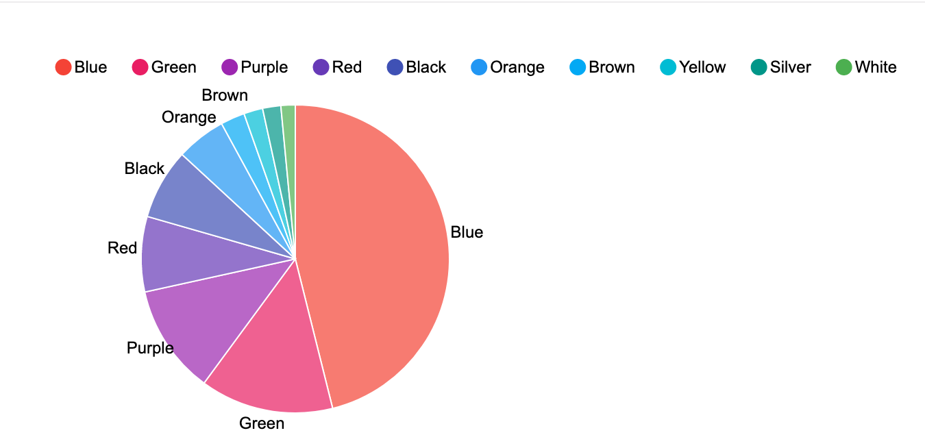
Pie charts are presented for categorical data with limited number of categories or classes.
Examples include data such as eye colors that only have a fixed list of values (categories or
labels).
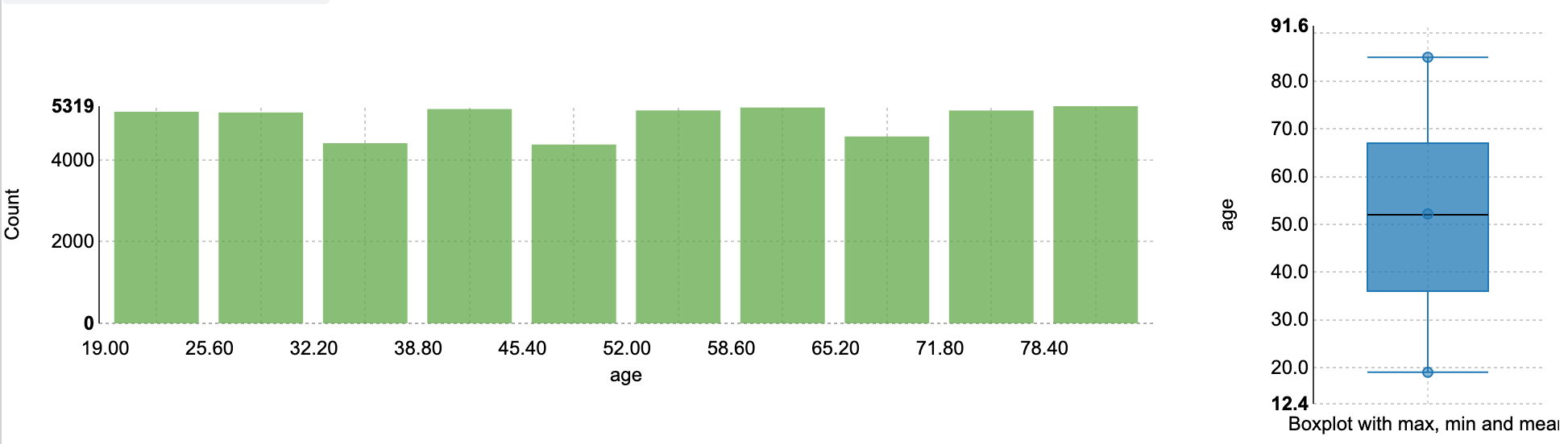
When the data within columns is numeric, a histogram of the distribution of values organized
into 10 groups (decile frequency histogram) and a box plot with a five-number summary (mean,
median, quartiles, maximum, and minimum values) are shown for the column.
This site uses cookies and related technologies, as described in our privacy policy, for purposes that may include site operation, analytics, enhanced user experience, or advertising. You may choose to consent to our use of these technologies, or