Using the Cloudera Observability user interface
Describes a few frequently used interface elements of Cloudera Observability that help you identify and troubleshoot your workload issues.
The following examples describe a few interface elements of Cloudera Observability that enable you to quickly identify workload problems, health issues, resource contentions, and abnormal or degraded performance problems.
These examples assume that you have logged in to the Cloudera and accessed the Cloudera Observability web UI from the Your Enterprise Data Cloud landing page.
Identify workload problems and health issues
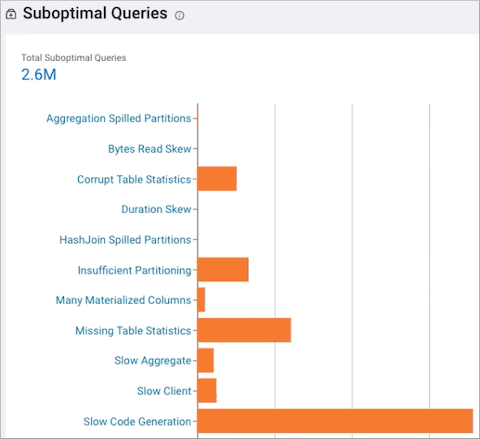
You can easily locate what engines are running on your clusters from the environment's Cluster Summary page and what jobs and queries are failing the health tests with the Suboptimal chart widget.
The Suboptimal chart widget, displays the distribution of jobs and the jobs and queries that failed. This chart widget enables you to visually see at a glance what issues are currently impacting your jobs or queries and how they are executing on your cluster.
Identify and address resource contentions
-
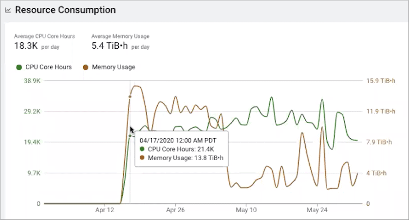
The Resource Consumption By Services chart widget displays the CPU and memory consumption for each service across the time range you selected. Hover your mouse over the timeline, to display the percentage of CPU or memory consumed by each of the cluster's services.
Location: The Resource Consumption By Services chart widget is found on the Cluster Summary page of a Classic Cluster, Private Cloud Base, and a Data Hub cluster.
- The Resource Consumption By Nodes chart widget displays the CPU
and memory consumption for each node in the cluster. Hover your mouse over the time
line, to display the amount of CPU or memory, as a percentage, that is consumed by each
node and its services.Location: The Resource Consumption By Nodes chart widget is found on the Cluster Summary page of a Classic Cluster, Private Cloud Base, and a Data Hub cluster.

- The Memory Utilization chart widget, displays the aggregated
maximum amount of memory that is used by the queries on any node performing the
processing. It helps you identify inefficient queries that are consuming the most amount
of memory and decide if you need to allocate more memory to continue running your query
jobs.
Location: The Memory Utilization chart widget is found on the Impala engine's Summary page, which, depending on the environment selected, is accessed by selecting the environment for analysis in the Environments page and then in the Environment navigation panel, drilling down through the environment's categories and selecting an engine of interest.
- The Resource Consumption chart widget, displays the concurrent
use of CPU and memory consumption for a workload across the timeline you selected.
Location: The Resource Consumption chart widget is found on the Impala engine's Summary page. which, depending on the environment selected, is accessed by selecting the environment for analysis in the Environments page and then in the Environment navigation panel, drilling down through the environment's categories and selecting an engine of interest.
Identify and address abnormal or degraded performance problems
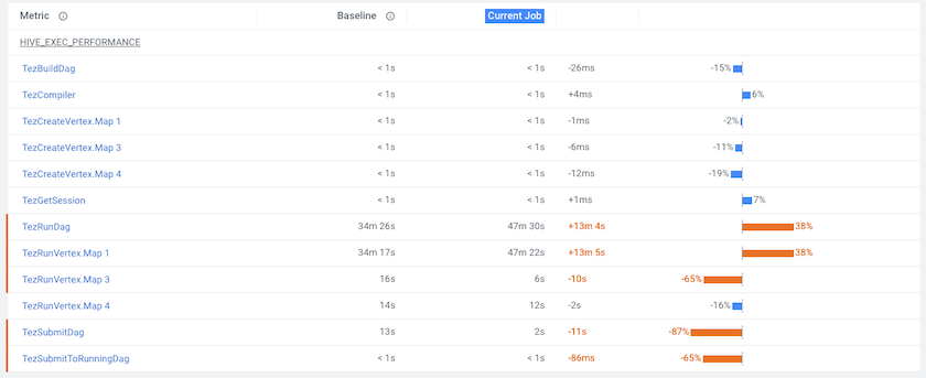
Cloudera Observability enables you to identify and address abnormal or degraded performance problems by establishing baselines from health issues that also enable a performance comparison of your workloads. The Cloudera Observability baseline metrics measure the current performance of a job against the average performance of previous runs. They use performance data from 30 of the most recent runs of a job and require a minimum of three runs. The baseline comparisons start with the fourth run of a job.
- This image shows the comparison between the baseline performance metrics and the
current job run:
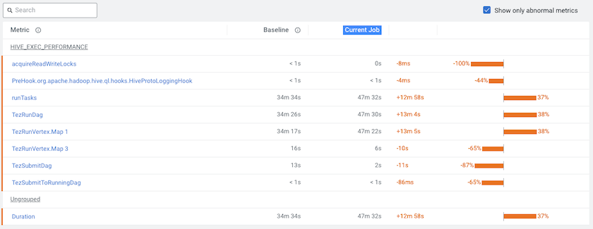
- To display only those metrics with performance issues, select Show only
abnormal metrics:
Identify performance trends
- The engine's job or query Trends time-series chart widget,
displays more detailed metrics about the processed jobs and queries and enables you to
view historical trends for analysis when you select a predefined or custom time period
from the Time-Range filter list.
Location: This chart widget is found on the Cluster Summary and the engine Summary pages, which are accessed by selecting the environment and then the cluster for analysis or by selecting the environment, followed by the cluster, and then the engine for analysis.
- The Trends tab, displays the job or query's instances executed
during the selected time period. Depending on the engine, the Trends page displays a
job's historical trend from Duration, Data Input, and Data Output histogram charts or
lists the runs of the query to show how its performance changes
overtime.
Location: The Trends tab is found on the Jobs or Query's page, which is accessed by selecting the environment, followed by the cluster and then the engine for analysis, then depending on the engine, clicking the Total Jobs or Total Queries in the Job Trend chart widget, selecting the job or query of interest, and then selecting the Trends tab.