Line visuals with dual axes
It is often enlightening to see related dimensions on the same line chart; it clearly shows both correlation and pattern. However, values may be measuring completely different things, or the range of values (scale) is too different to show both lines clearly. offers a dual axis option for situations like these.
The following steps demonstrate how to create a line visual that uses a double axis; it is
based on dataset World Life Expectancy [data source
samples.world_life_expectancy].
-
Click Refresh Visual.
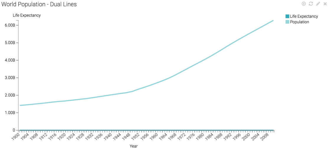
The line visual appears.
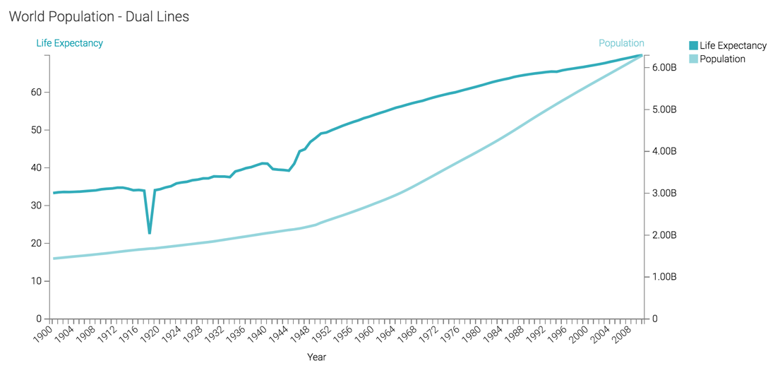
It is impossible to see the values on the life expectancy line because the population line sets the scale for the Y axis.
In this case, the label does not correspond to the scale shown, because this information comes from the Y axis shelf.
-
On the Colors shelf, on
sum(population)field, click the Down arrow icon, select Axis, and then select Secondary Axis.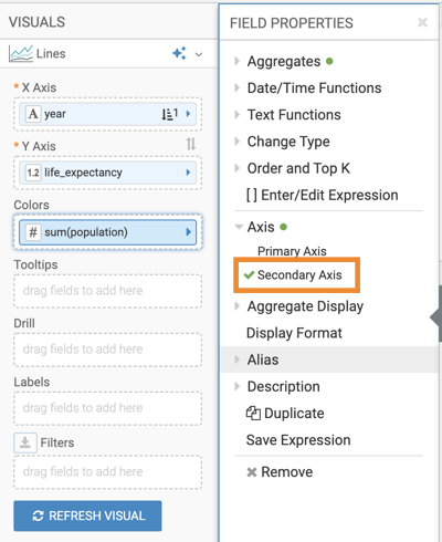
-
Click Refresh Visual.
The two lines can now be seen clearly.
There is now a vertical axis both on the left and the right side of the visual. For convenience, the color of the axis labels match the line.