Lines
In CDP Data Visualization, a line chart displays information as a series of data points, or markers, connected by straight line segments. It reveals trends or change over time. Line charts show relationships within a continuous data set, and can be applied to a wide variety of categories. While line charts are similar to scatter plots, the line chart orders the measurements along the primary axis and it is often used to visualize a time series.
The following steps demonstrate how to create a new Lines visual on the World Life Expectancy dataset.
For an overview of shelves that specify this visual, see Shelves for lines visuals. For customization options, see Settings for lines visuals.
-
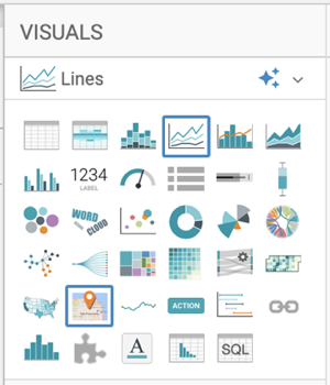
In the VISUALS menu, find and click
Lines.
The shelves of the visual changed. The mandatory shelves are X Axis and Y Axis.
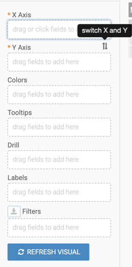
The fields placed on these two shelves may be easily swapped by switching X and Y.
-
If the field on the Y Axis appears as a sum aggregate, change
the aggregate to
avg(life_expectancy):-
Select .
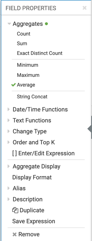
The shelf now contains the modified field with
avg()aggregation function.Alternatively, you can change the aggregation at the level of the dataset, as described in Changing field aggregtion.
-
Select .
-
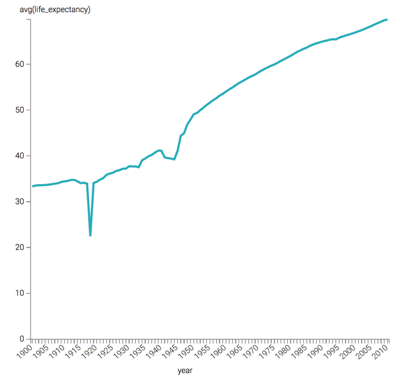
Click REFRESH VISUAL.
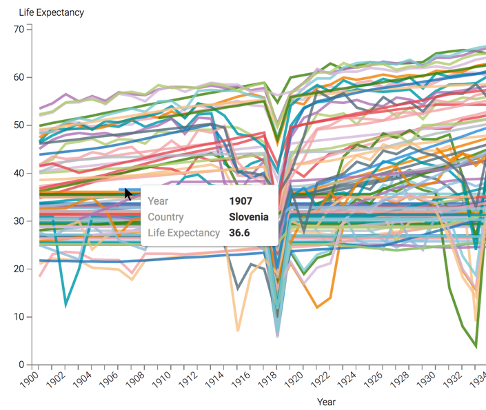
The Lines visual appears.
-
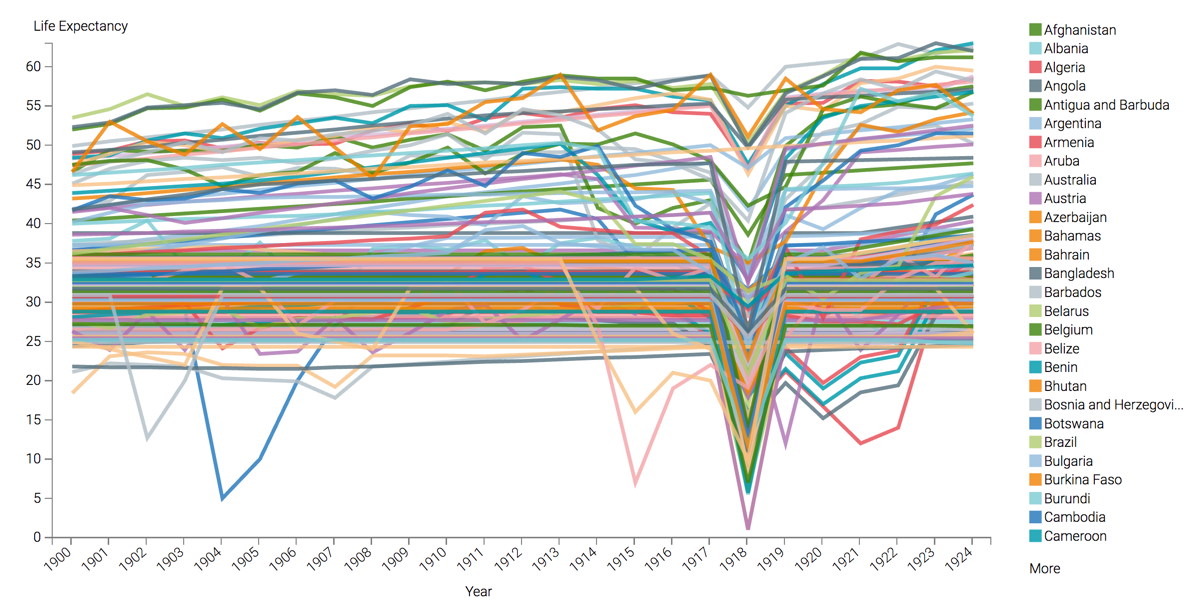
Click REFRESH VISUAL again.
The single line is broken out into country components, and CDP Data Visualization automatically provides a color legend.
-
Click REFRESH VISUAL.
The updated Lines visual appears. Some of the lines do not originate at the beginning of the time series. This is because their population were lower than the
10,000,000threshold that you set in the population filter.