
Adding transition animation to scatter visuals
Scatter visuals have a powerful feature called transition animation.
In the World Life Expectancy dataset, the time is used as the transition 'axis' to show how GDP per capita, life expectancy, and population size changes over time, from year 1990 through year 2010.
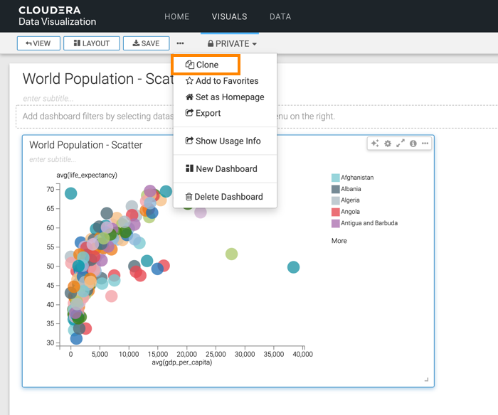
The starting point of the following example is the 'World Population - Scatter with Size' visual developed in Adding size to scatters.
-
Click Clone to create a new visual that has the same properties
as the original.
-
Click REFRESH VISUAL.
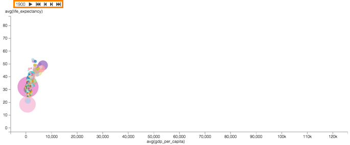
The Scatter visual refreshes, but this time you can see that it has animation controls at the very top, over the vertical axis legend. The controls common to all video animations: 'play' (which changes to 'pause' when the animation is active), 'back to start', 'back-up', 'advance', and 'to end'.
You can also notice that both axes extend far beyond the data points for the initial conditions, year=1990. This is because the cover the entire range of measurements for all data.
-
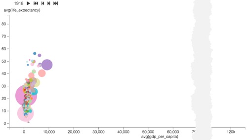
Press play and see the changes in data.
Here are some highlights:
- The World-Wide downward bounce in life expectancy centered on 1918, due to the
Spanish Flu pandemic.
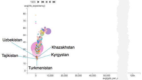
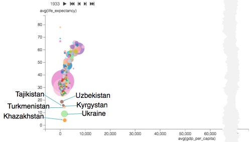
- The Soviet Union secularization efforts and agricultural policies in its Asian
territories resulted in war and famine that claimed many lives in Uzbekistan,
Kazakhstan, Tajikistan, Kyrgyzstan, and Turkmenistan. This is reflected in the
precipitous decrease in life expectancy for these countries in 1919-1923, with
heaviest losses in 1920.
- There was another significant decrease in life expectancy due to the loss of as many
as 8 million lives in the Soviet famine of 1932–33 and more specifically, the
Hlodomor. Soviet Union farm collectivization in the Russia and Ukraine withheld grain
from farmers and collectivized farms until unrealistic production quotas were be
met.
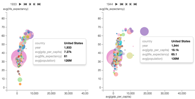
- The United States economy grew rapidly from mid-1930s through mid-1940s, because New
Deal's economic relief and work creation policies stabilized the country after the
Great Depression, while the World War II material support of the Allies and its own
involvement in Europe, Africa, and the Pacific meant even greater production of
materials, armaments, and two new naval fleets. You can see that GDP per capita
increased nearly 3-fold, while the population increase and life expectancy were
relatively modest.
-
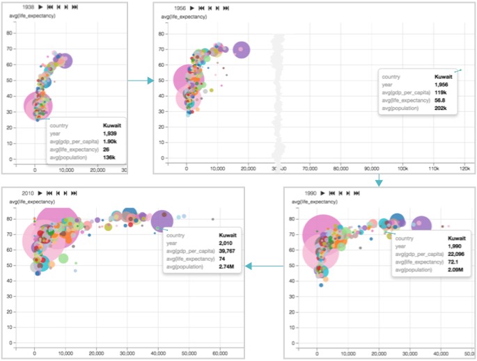
The exceptional increase in GDP in a very modest country of Kuwait after the discovery of the world's sixth largest oil deposits in 1938, through 1956 peak levels of GDP per capita growth, and large scale modernization from 1946 through 1982. After a period of international instability in 1980s, the 1990 invasion by Iraq destroyed much of the infrastructure. After 1991 US intervention, the country has been rebuilding its infrastructure.
- The World-Wide downward bounce in life expectancy centered on 1918, due to the
Spanish Flu pandemic.
While we can see the data for individual countries more clearly, it is often useful to contrast well-defined logical segments of data.
As a next step,you can compare and contrast GDP per capita and life expectancy for different UN Regions in Adding trellises to scatter visuals.
