
Understand the Data Visualization user interface
CDP Data Visualization enables you to explore data and communicate insights across the whole data lifecycle by using visual objects. The web-based user interface provides user-friendly, clear and intuitive navigation in Data Visualization.
The default CDP Data Visualization homepage contains the following main items:
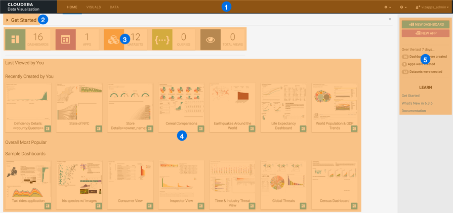
- The Main navigation bar offers you direct access to the following
interfaces:
- Home
- Visuals
- Data
- Settings
- Help
- User management
- Get Started points to help content embedded in the tool.
- Statistics banner shows the number of Dashboards, Apps, Datasets, Queries and Total Views that you can access.
- Visuals preview area provides quick access to the existing visuals and dashboards.
- Homepage side menu bar offers you access to the following
functions:
- NEW DASHBOARD takes you to the Dashboard Designer interface, where you can create new dashboards and visuals.
- NEW APP takes you to the App Designer interface, where you can build and style custom applications from existing dashboards and visuals.
- Over the last 7 days... shows statistics on how many dashboards, apps, and datasets were created.
- In the LEARN section, you can find the following
information:
- The Get Started link points to help content embedded in the tool.
- The What's New in link opens a modal window showcasing new features.
- The Documentation link opens this library.
If you need more information about the UI, see CDP Data Visualization homepage.
